Construction Junction
Mobile app UI design & interactive prototype
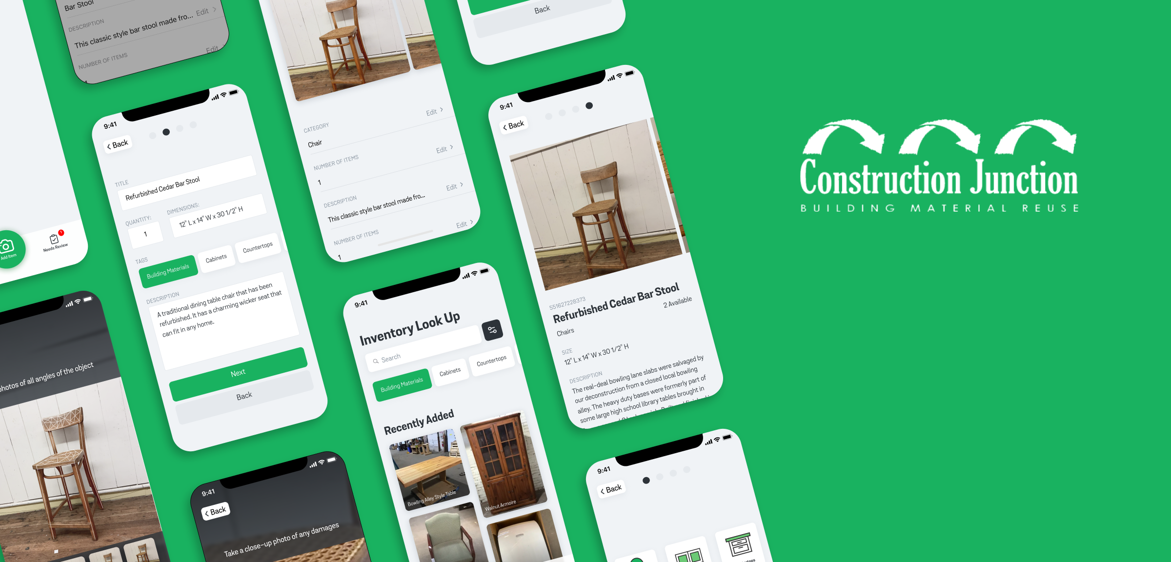
About the Project
Prototyping a digital service for cataloging donations
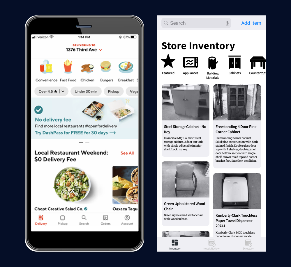
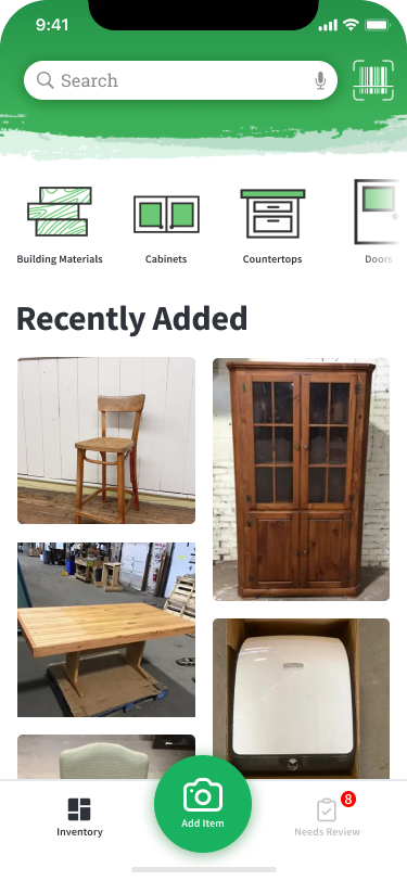
For our first project in Interaction Design Studio II, my team and I designed a mobile digital service for Construction Junction, a non-profit that supports conservation by accepting and reselling used furniture and building materials. While the assignment was to create a customer-facing app, our research showed greater value through instead creating an employee inventory management system that allows for easy cataloging of new donation items.
My Role
Art direction, UI design, prototyping
Client & Context
Fictional student project for Construction Junction
Deliverable
Link to PrototypeAdditional Team
-
Christie Sohn
Designer (MHCI)
-
David Domalik
Designer (BHCI)
-
Lauren Park
Designer (BHCI)
Background
Figuring out what our client would truly need
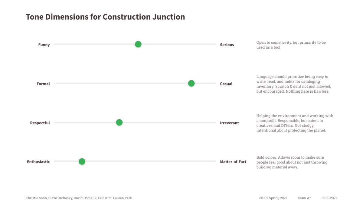
When researching an app design concept for Construction Junction, our initial goal was to create a customer-facing application that would create a remote way for customers to browse products. To first understand the brand and company mission, our team first looked at the website and social media and created a Tone of Voice model as a means of objectively creating for the brand.
We based our assessment on Nielsen Norman Group’s Four Dimensions of Tone of Voice.
As part of our research, our team also created a stakeholder map. We wanted to learn about all of the key players and understand who deserved our attention when creating this app.
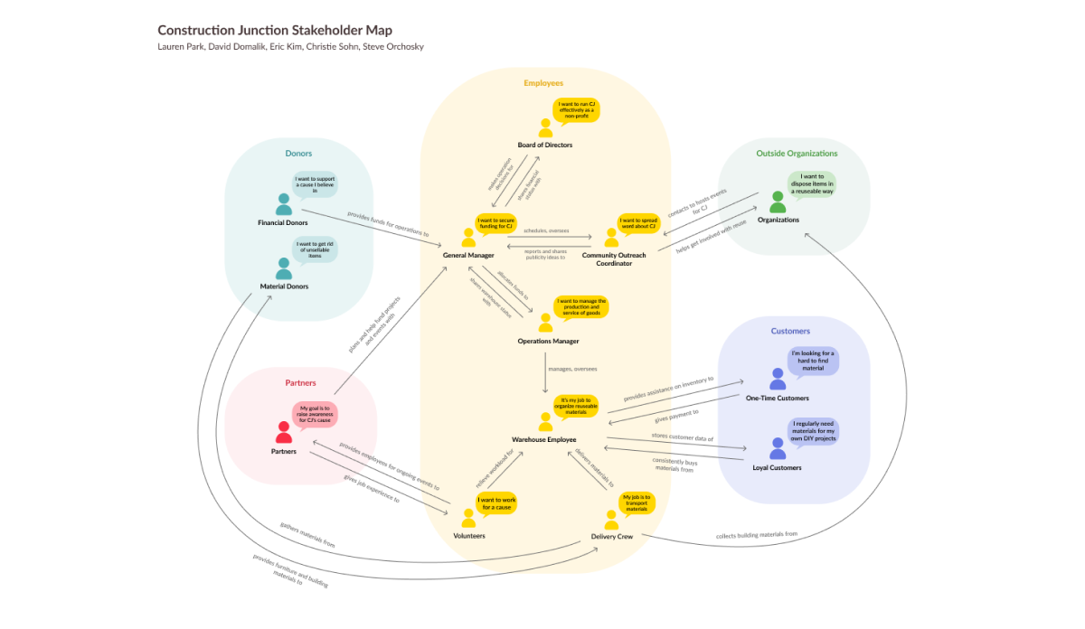
We were surprised that Construction Junction supports many different volunteer initiatives, such as a Goodwill Job Training Partnership to give work experience to people with barriers to employment. However, this also revealed that there was a fairly high rate of churn among volunteers. Knowing this, we set our sights on creating a mobile volunteer assistant.
Prototyping
Initial sketching, identifying objectives, and creating the main user flow
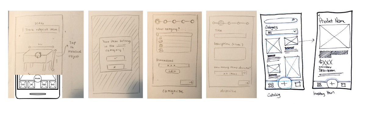
Each team member created separate wireframes in parallel to visualize four unique visions for the app to compare and contrast. Below are the sketches that I contributed.
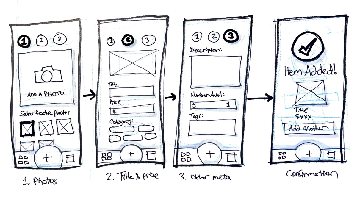
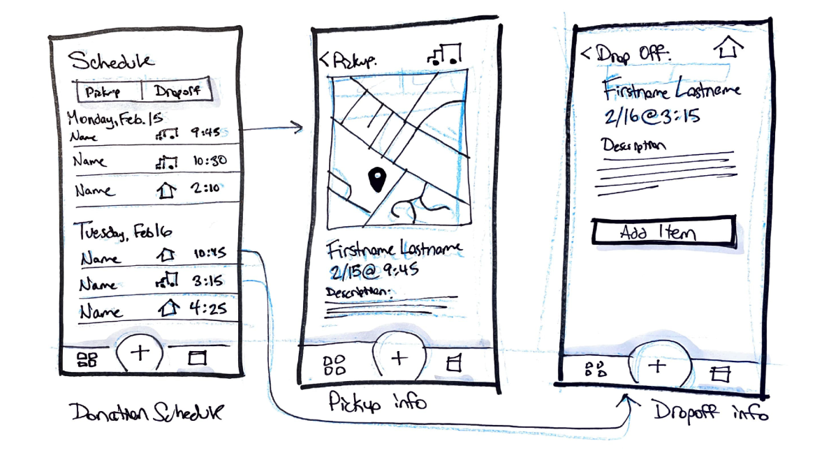
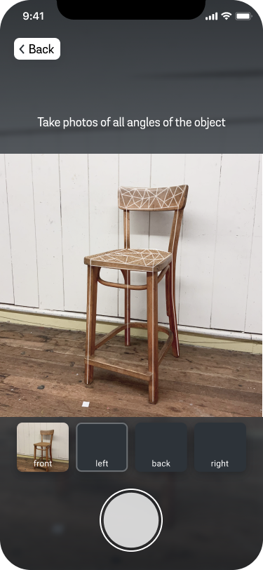
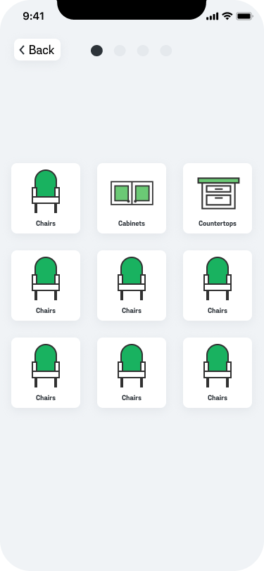
Based on our team critique and through user testing with other classmates, we decided that inventory cataloging and management was the biggest area to add value for volunteers. We combined our approaches and established a single user flow that focused on cataloging.
We next began digitizing our sketches in Figma. To maximize efficiency, we leveraged design patterns from our team’s collective experiences with other apps to inspire how to lay out some different features.
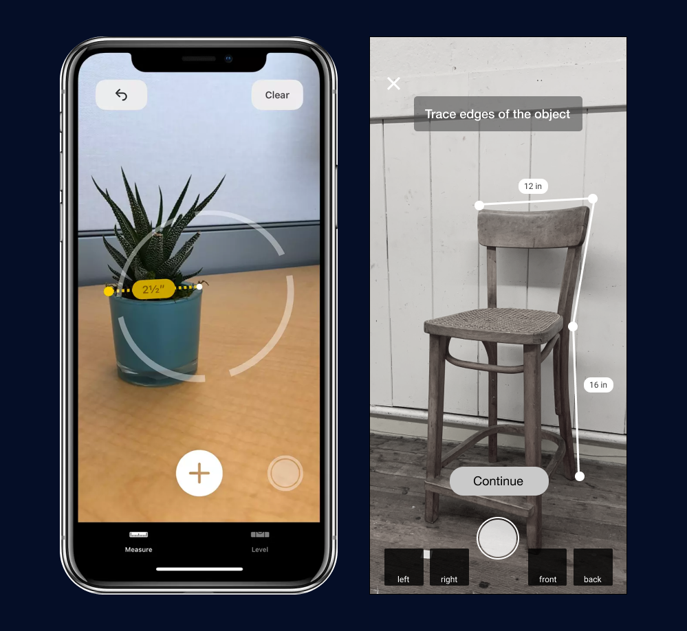
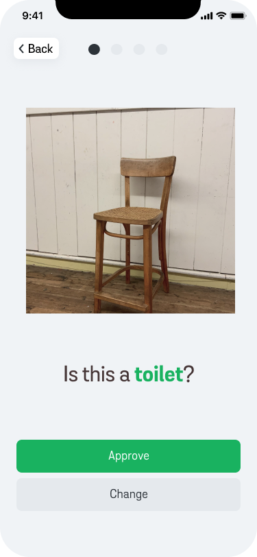
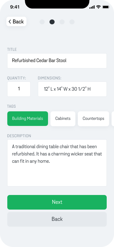
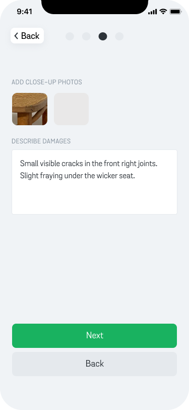
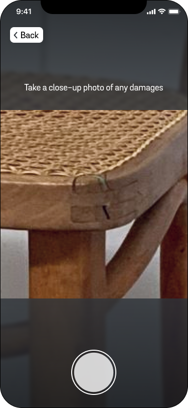
Refining the low fidelity prototype and critique in class raised a lot of questions around the types of access that volunteers should have access to versus full time employees. Critique also encouraged questions around what data needs to be captured as new donations are processed, such as potential damages of used objects.
Visual Design
Applying the client tone of voice to brand the service
Once our mid fidelity designs were in place, we began discussing how to include color and brand into the design. In our design for class, we created a colorful interface that emulated the paint texture from their website and social media.
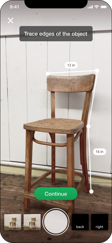
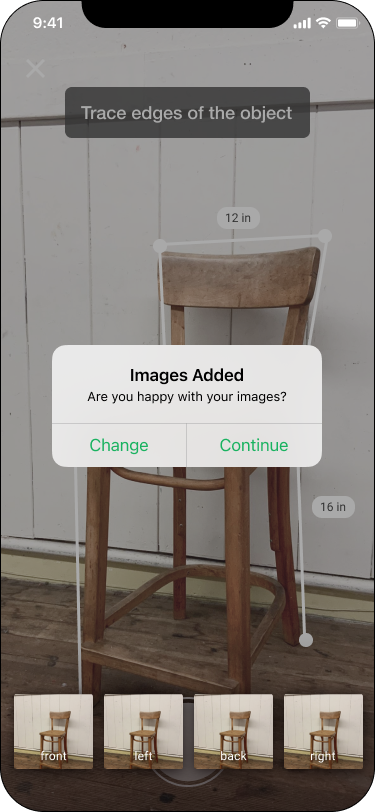
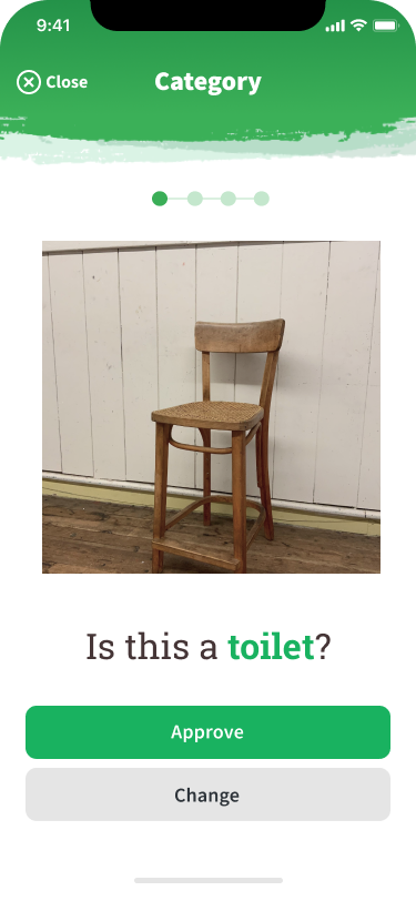
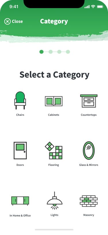
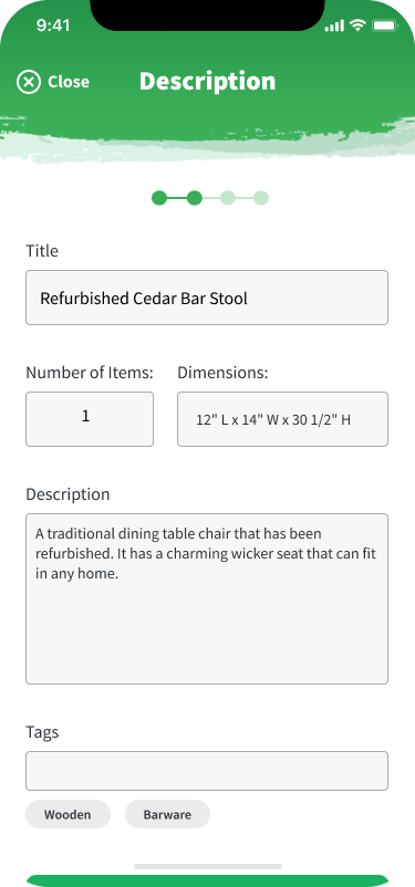
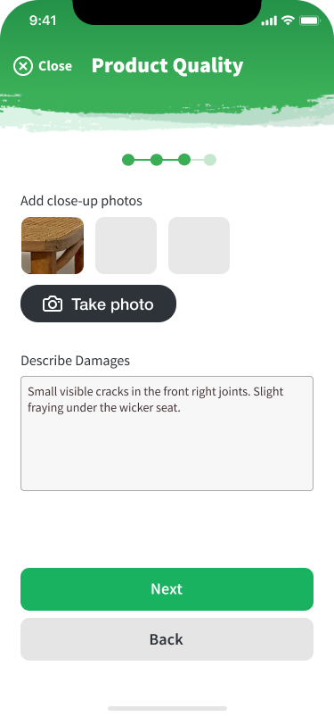
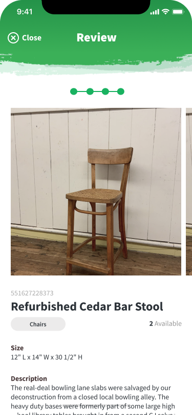
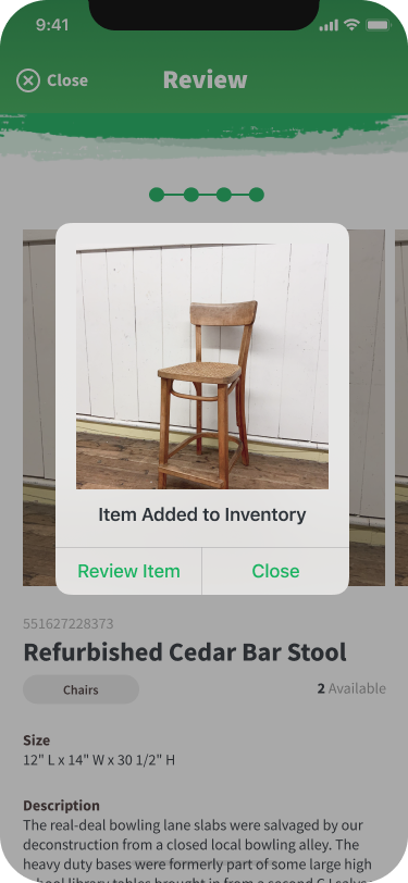
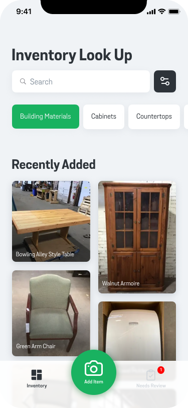
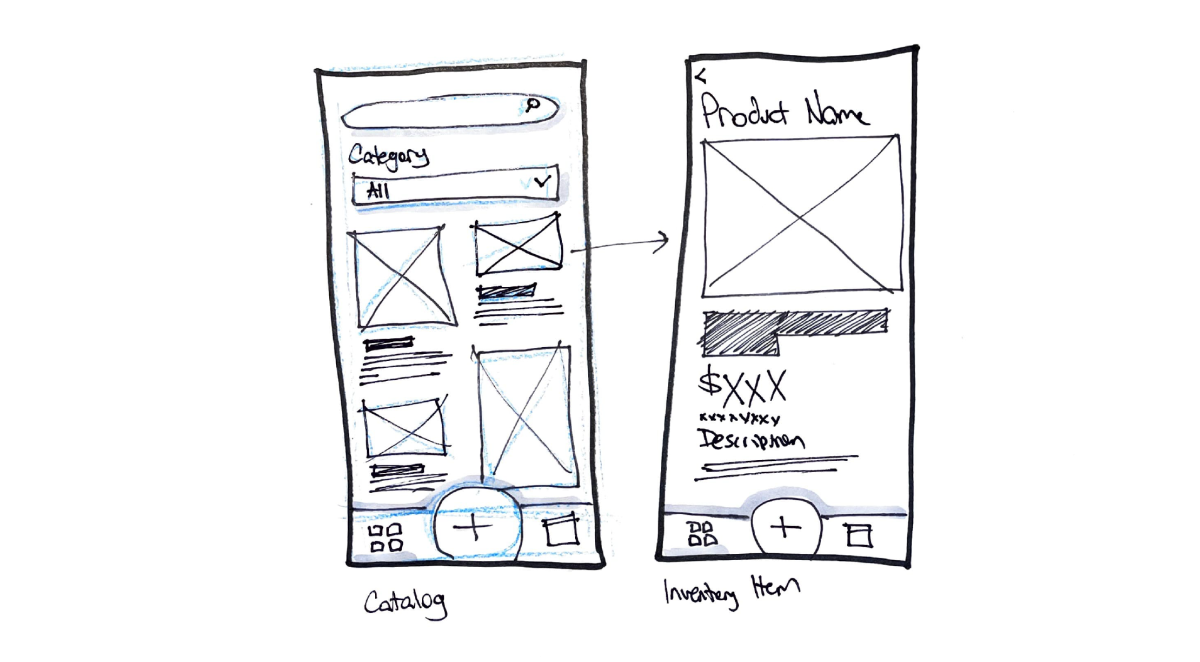
When designing our high fidelity, we broke the user flow of our mid-fidelity design into four sections. I was responsible for the Inventory landing screen and Item Review.
As we were working, we leveraged Figma’s Color and Text Styles for consistency. However, for many UI elements, we were copying and pasting from each others’ work. This made it challenging for individuals to make edits that could be applied consistently across the entire app.
While it was time consuming, repeated viewing of the prototype made slight alignment errors apparent, and we created one cohesive prototype design which we could pitch to the class.
Reflection
Approaching the design as a system, not just a product
After the project, I reflected on how this process could have been improved. About a month after the project, I learned at Config 2021 how robust the variable components can be when creating a design system for a mobile application. I realized that not using these components properly was creating barriers to quicker iteration.
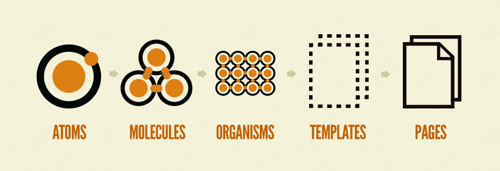
In my redesign, I took an Atomic Design approach by starting with the smallest components I knew I would need and working my way up to more complex components and layouts.
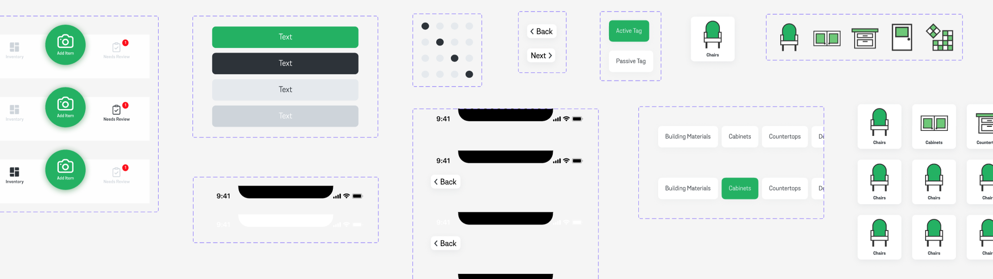
I used this system to create a new version of the high fidelity prototype. Since this was a new project I would take on solo, I also used this chance to put my own take on the brand, simplifying to a utility-focus since this would be an employee-facing tool instead of a public interface.
You can view the final screens below or interact with a working prototype