Kelly Strayhorn Theater
User-Centered Research & Evaluation
About the Project
Creating a way to introduce new performance art attendees to critique and engage with art
In this project, I was responsible for research synthesis and prototyping a new service to improve engagement with first-time audience members of remote theater performances for Kelly Strayhorn Theater. My team and I created Dance Dance Revelation, a critique prompter for remote theater performances, as a way to foster post-show interactions between artists and audience members remotely.
My Role
Evaluation & Strategy Lead
Client
Student project for Kelly Strayhorn Theater
Deliverable
Research and prototype
Additional Team
-
Emily Zou
Project Manager
-
Jailyn Zabala
Research Lead
-
Sabrina Zhai
Prototyping Lead

Opportunity
Finding new ways for people to experience performing arts during the pandemic
The Kelly Strayhorn Theater (KST) is a performing arts theater in East Liberty, Pittsburgh. Over the past year, the neighborhood’s unsafe reputation coupled with the COVID-19 pandemic has resulted in a huge decline in public engagement with performing arts.
As part of a class project for User-Centered Research and Evaluation (UCRE) during my Master’s at Carnegie Mellon, our class goal was to find ways in which KST can continue their mission of bringing diverse communities together through creative expression leveraging online or pandemic-compliant measures.
Client Data Analysis
Not surprisingly, the pandemic has taken a toll on theater attendance
Our project kicked off with a Q&A session with Joseph Hall, the general manager of KST, to learn more about the theater’s background. In addition, we were provided with client data based on website metrics and ticket sales to help establish a baseline for current engagement. After cleaning and labeling the data, I was responsible for visualizing the data used Excel and Tableau.
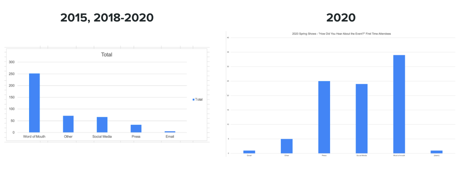
Throughout all data we had available, we discovered that most first-time attendees find events through word-of-mouth. However, during Spring of 2020 we noticed that Social Media and Press have become more effective avenues for reaching first-time attendees to KST events. Another insight that we pulled from the data confirmed that music and dance are the most popular event categories. This was interesting to our group since we were not familiar with KST, but seemed to align with the brand and talent affiliated with the theater.
Think-Aloud Study
How do people plan a performance art experience using the web?
As part of a class exercise before this project, we individually conducted think-aloud studies on KST’s website, so we already had some insights around its usability. For our first research exercise as a team, we conducted think-aloud studies on a local competitor, the Pittsburgh Public Theater (PPT), to discover underlying needs that could be applied to Pittsburgh performing arts organizations as a whole. We asked our participants to perform three tasks:
Find an event that you would be interested in attending.
Choose a restaurant partnered with the theater that you would like to eat at before a show.
List two ways that you can help the theater.
Upon completing the study, our most critical finding is that the website under-emphasizes how participants can register for an online performance, a similar issue as KST. This was evident with all of our participants, including a frequent PPT theater-goer that hasn’t seen an online performance during the pandemic due to this difficulty. Second, we notice most participants would not be incentivized enough to donate, and that there are no noticeable ways to volunteer. Finally, when asked about restaurants partners, we discover that participants prioritize relative location to the theater and that partnerships were underemphasized.
Contextual Inquiry
What can performing arts learn from streaming services and other ways people consume digital media?
To continue to understand how people engage with media at home, we began to design a Contextual Inquiry session. For this research, we found four participants that were willing to let us join them while they engaged with media as they would naturally at home. We conducted sessions through Zoom using screen sharing and while watching media over a streaming service. While watching, we asked questions around how they typically engage with media to learn more about their ideal environment, time of day, and other features that help to enhance their experience. Each session lasted approximately one hour.
After each inquiry, our team got together for an interpretation session, where we wrote down over 20 insights for each participant about how they engage with media at home. With over 80 insights, plus our notes from prior research sessions, we were at a great place to start synthesizing data into potential innovation opportunities.
Affinity Mapping
Mapping our insights to inform generative research
At this point, we had gathered a lot of information around how people interact with media. Our next step was to aggregate our insights into an affinity diagram to inform where we would get the most value creating a solution for KST. To create our affinity map, we used Mural as a virtual white board.
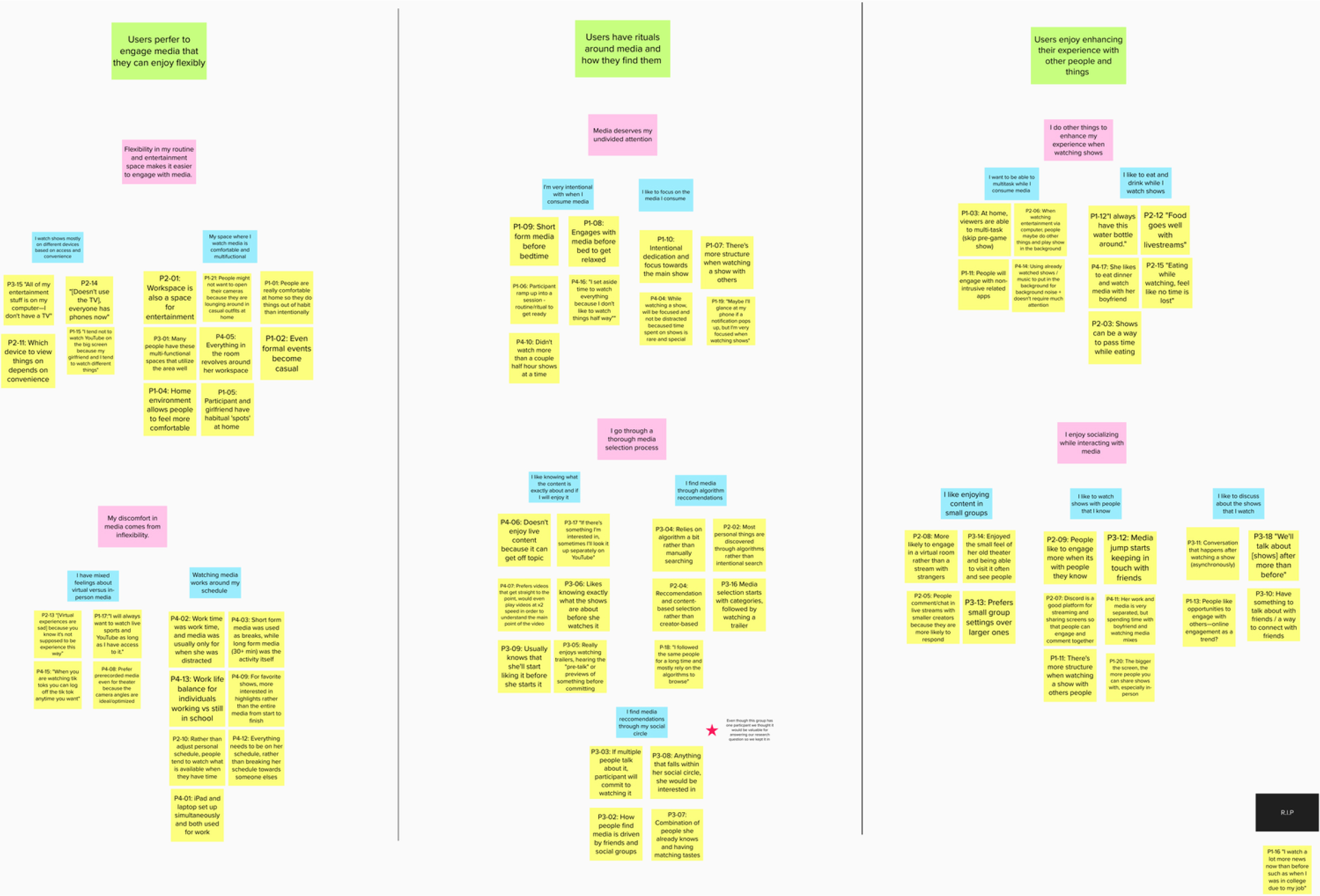
Each affinity was nested into groups, where yellow was an individual insight from our Contextual Inquiry interpretation sessions. Grouping gradually became more broad moving from blue to pink labels, with green labels representing the broadest categories. This organization gave us prompts we would use to start generating ideas in our next phase.
Generative Ideation
Turning our thoughts and research into experiences
After creating our affinity map, we combined all of our research together to conduct a Walk the Wall session, where our team took a broad look at all the research we had done to this point. From this, we made a list of themes to work with to develop our initial ideas. For our first round of idea generation, we used Crazy 8's to create a 32 distinct solutions among the whole team, and as a way quickly get the 'obvious' ideas out in the open.
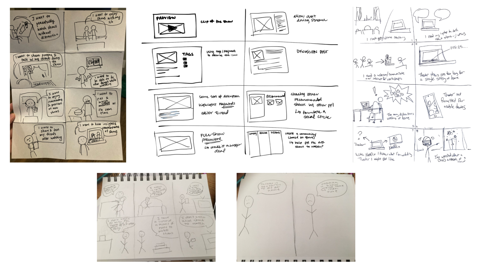
Upon looking at the results of our exercise, we highlighted four first-person user needs to be addressed:
I want to easily find what the show is about
I want to talk to other people while watching the show and see what they are seeing and feeling
I want to do other things while watching a show (eating, texting, cooking, etc.)
I have a limited amount of time to watch shows, so they need to fit to my schedule
With these ideas in mind, each team member took a user need and generated 3 storyboards with varying level of risk (low, medium, and high). We utilized these to conduct an exercise called speed dating. In this exercise, we recruited participants to preview our storyboards in three to five minute intervals to explore their initial reactions and uncover any user needs that we may not have picked up from our interpretation sessions. This exercise was done with a facilitator and a recorder for notes.
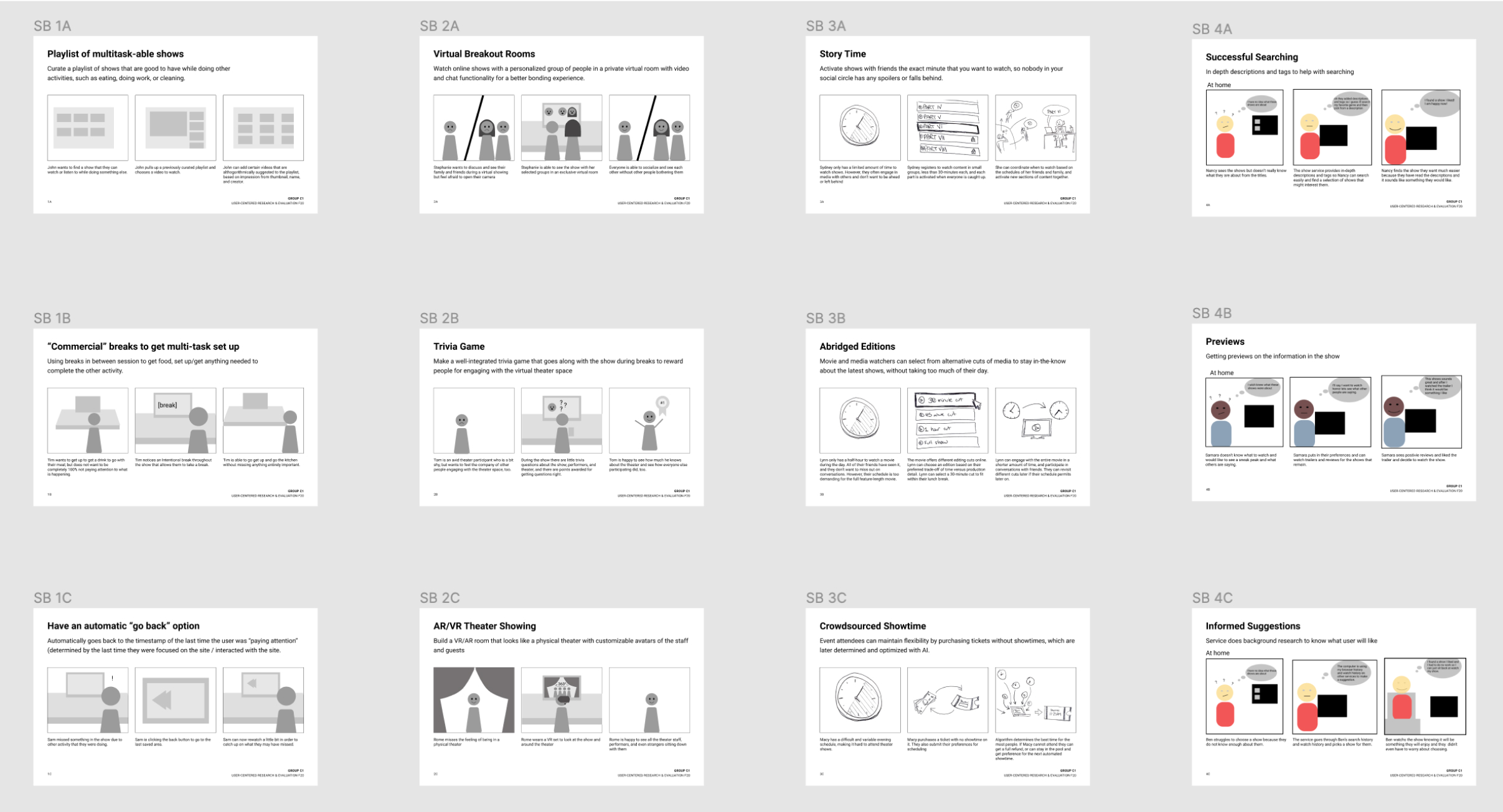
After each participant session, the two-person team organized all the storyboards from 1-12 based on intrigue, viability, and participant feedback. We organized them where 1 was received with positive feedback and co-design opportunities with the participant, and 12 brought the least participant engagement or interest. We compiled this into a dataset to score each of the ideas.
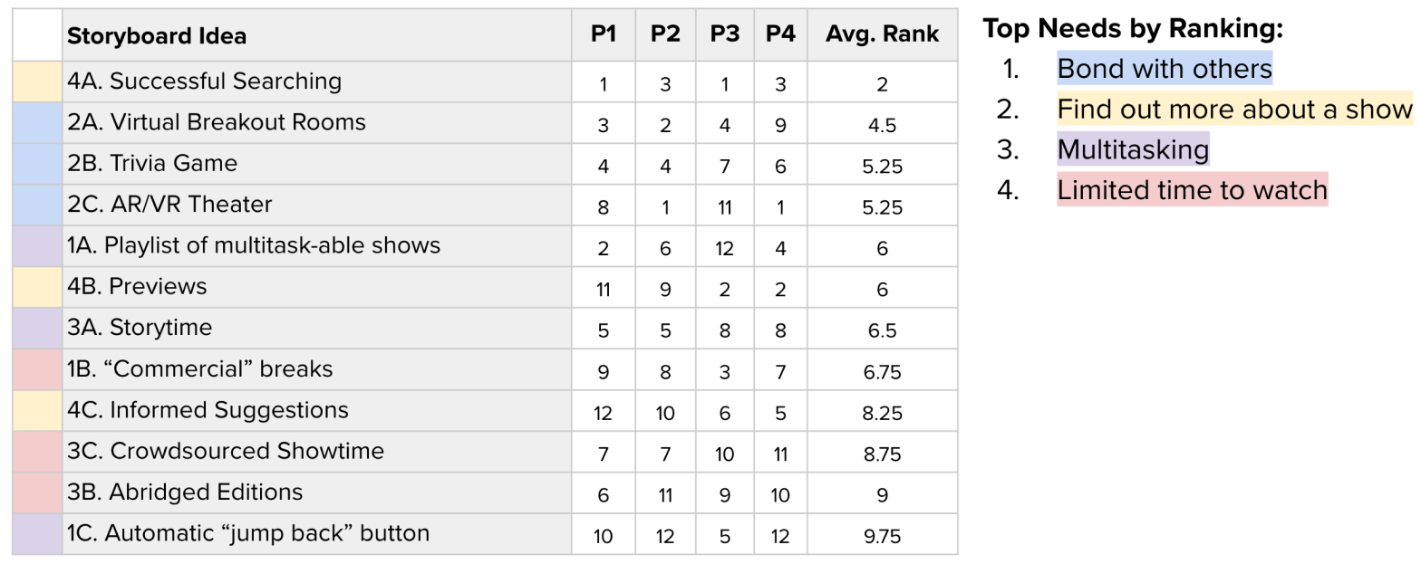
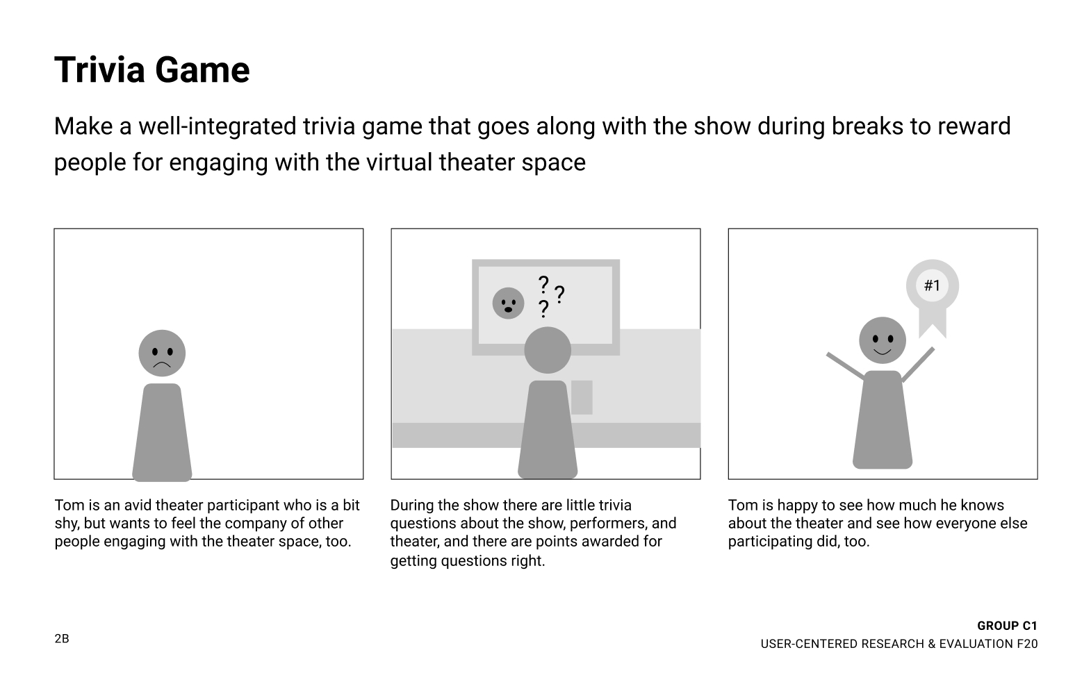
From our reviews, we learned that there was the biggest opportunity for innovation around bonding with people during shows. We decided to pursue 2B Trivia Game because it received a high average ranking, was in the strongest user need category, and was a prompt our team was passionate about exploring into a prototype.
Experience Prototyping
Designing and testing our research-backed solution
Using our storyboard as a reference, we first created wireframes for an interactive trivia game. We learned during our Contextual Inquiry sessions that viewers are comfortable viewing media on a large device while using a smaller screen for communicating with others. To build on this, we designed a low-fi experience prototype that incorporated a performance over Zoom with pop-up questions, and a mobile trivia interface.
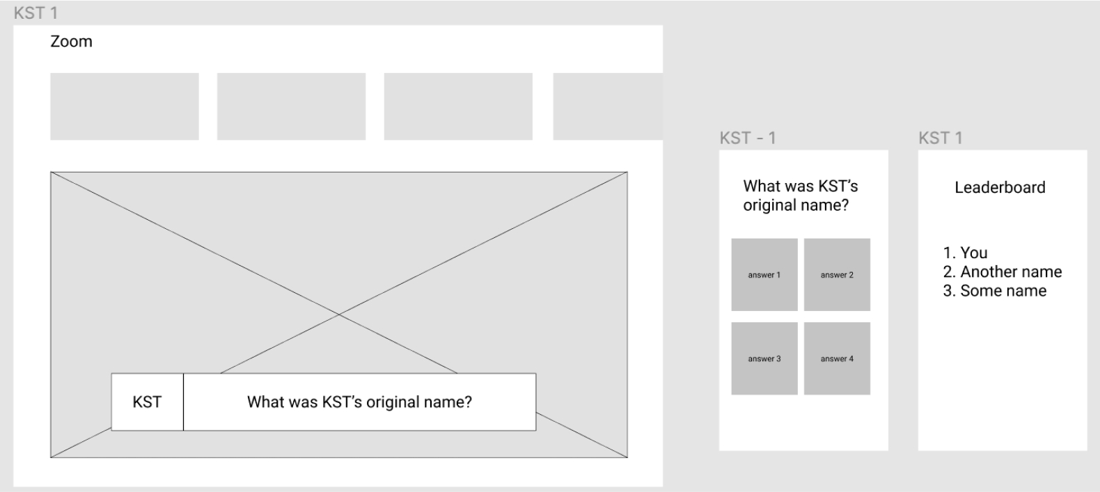
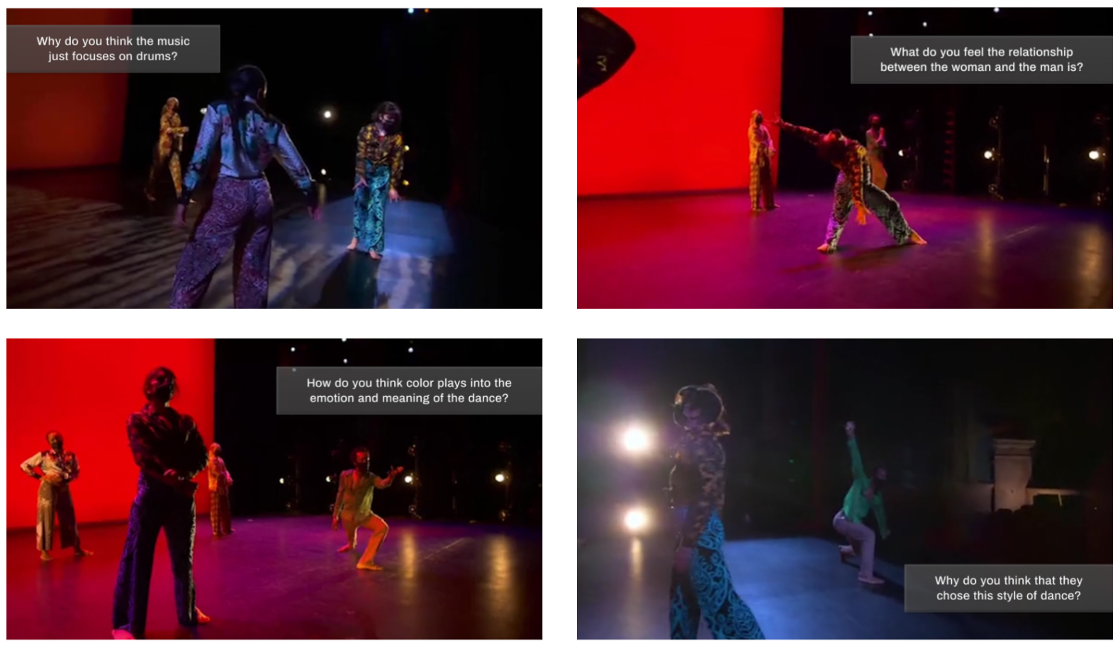
We tested this concept with classmates for viability, and through feedback learned that the pop-up questions were taking too much screen real estate. In our second iteration, we used smaller prompts on the large screen, and built out additional questions to simulate a more complete trivia session. We also sourced a video of a dance performance from KST’s Facebook page to give the prototype a little more context.
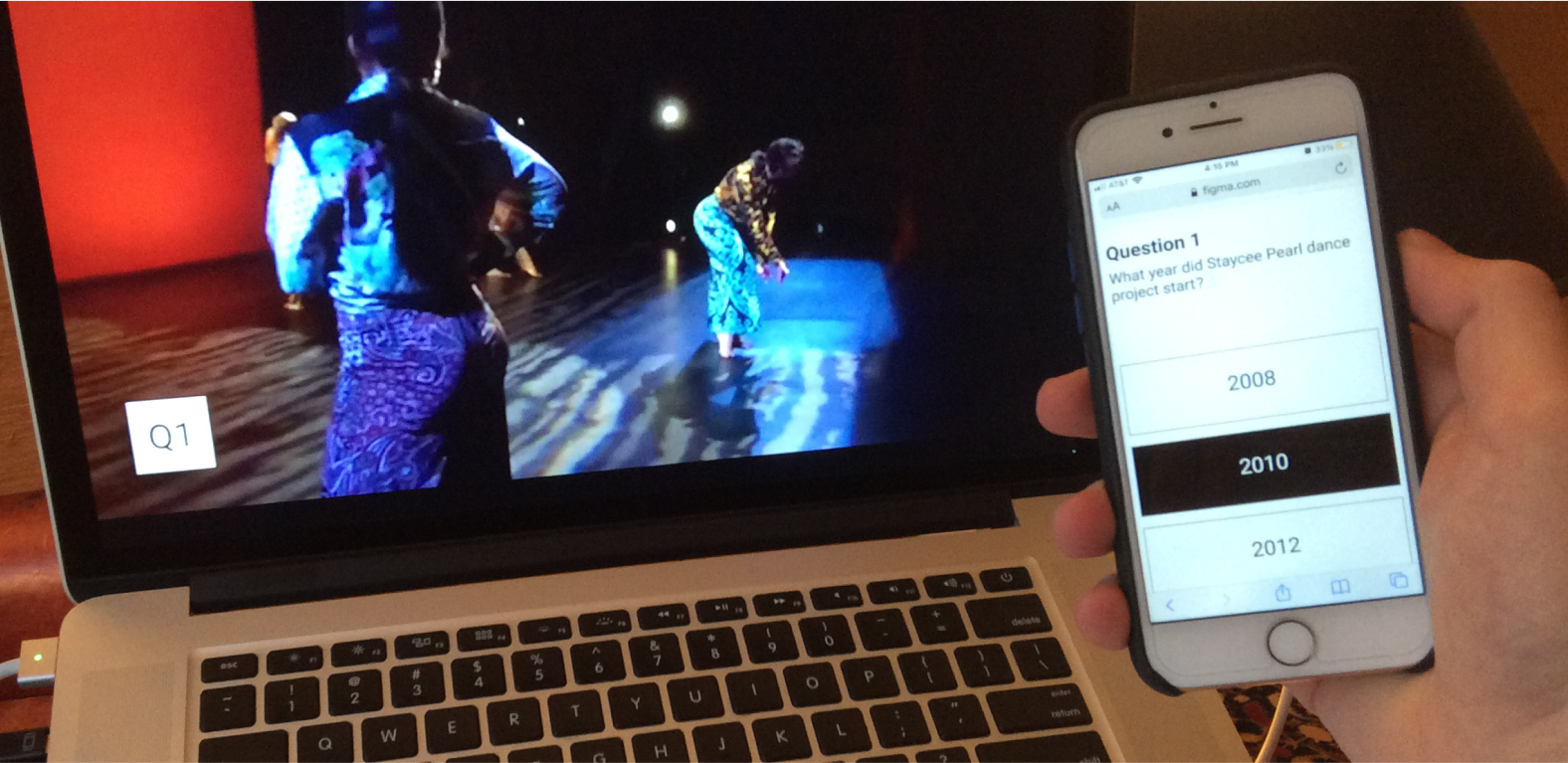
We recruited four participants to test the second iteration and noticed something interesting—our prototype was having an adverse effect from our goal. Our participants felt disconnected from the performance with the two-screen setup. Additionally, our participants were not frequent theater-goers, and they didn't feel they were connecting with others because they were guessing at questions related to the performance.
To meet these concerns, we took another look at our prototype and instead approached the trivia as a way to engage with the performance production team. By having the production team providing discussion prompts, we create an opening for first-time theater attendees to hold discussions with peers and performing artists that they would have felt isolated from in a formal performance art setting. An important part of this new experience is that questions do not have wrong answers, but are simply ways to foster discussion about how art impacts everyone uniquely.
Client Presentation
Sharing our findings with KST and peers
At our third iteration of our experience prototype, we were ready to share our work with KST. As part of our presentation, we developed an elevator pitch and poster which we would present to KST and guests during a virtual poster session. In this session, our team was assigned a dedicated breakout room on Zoom where guests could come and go to hear our pitch and ask questions about our solution. We titled our work Dance Dance Revelation as a nod to KST's thriving dance community, even though our solution could be adapted to many genres of work.
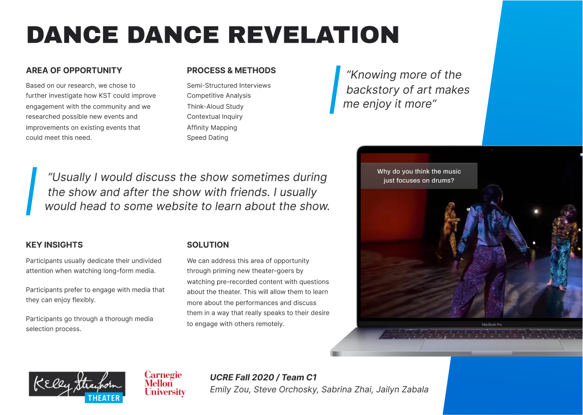
“After talking to the Kelly Strayhorn Theater, we found that the biggest area of opportunity for KST is keeping audience members feeling connected in a remote environment. We addressed this by priming new theater-goers while watching prerecorded content with questions about the theater. This will allow them to learn more about the performances and discuss them in a way that really speaks to their desire to engage with others remotely.”
We presented to a few guests, including one member of KST's media production team. While we advocated for branded captions to support the theater, we suggested using YouTube captions as a low-effort way to continue testing the idea with audiences. Additionally, we engaged in discussions about whether on-screen captions were distracting to more-experienced performing art attendees. We stressed that this would be an opt-in feature specifically targeting newer performance attendees.
Reflection
Leading design decisions with a myriad of research
This course was one of the primary reasons why I had decided to apply for my Master's in Human-Computer Interaction. I really enjoyed learning and applying all the research methods that we engaged with in User-Centered Research & Evaluation. This course showed me the value in not rushing to solutions before you take time to understand the problem and areas of opportunity. By applying a myriad of different research methods, I feel like our team looked at the opportunity space from all angles to help support our design solution.