Optum
A new digital healthcare service for life after COVID-19
About the Project
Design research and prototyping for an existing mobile health application
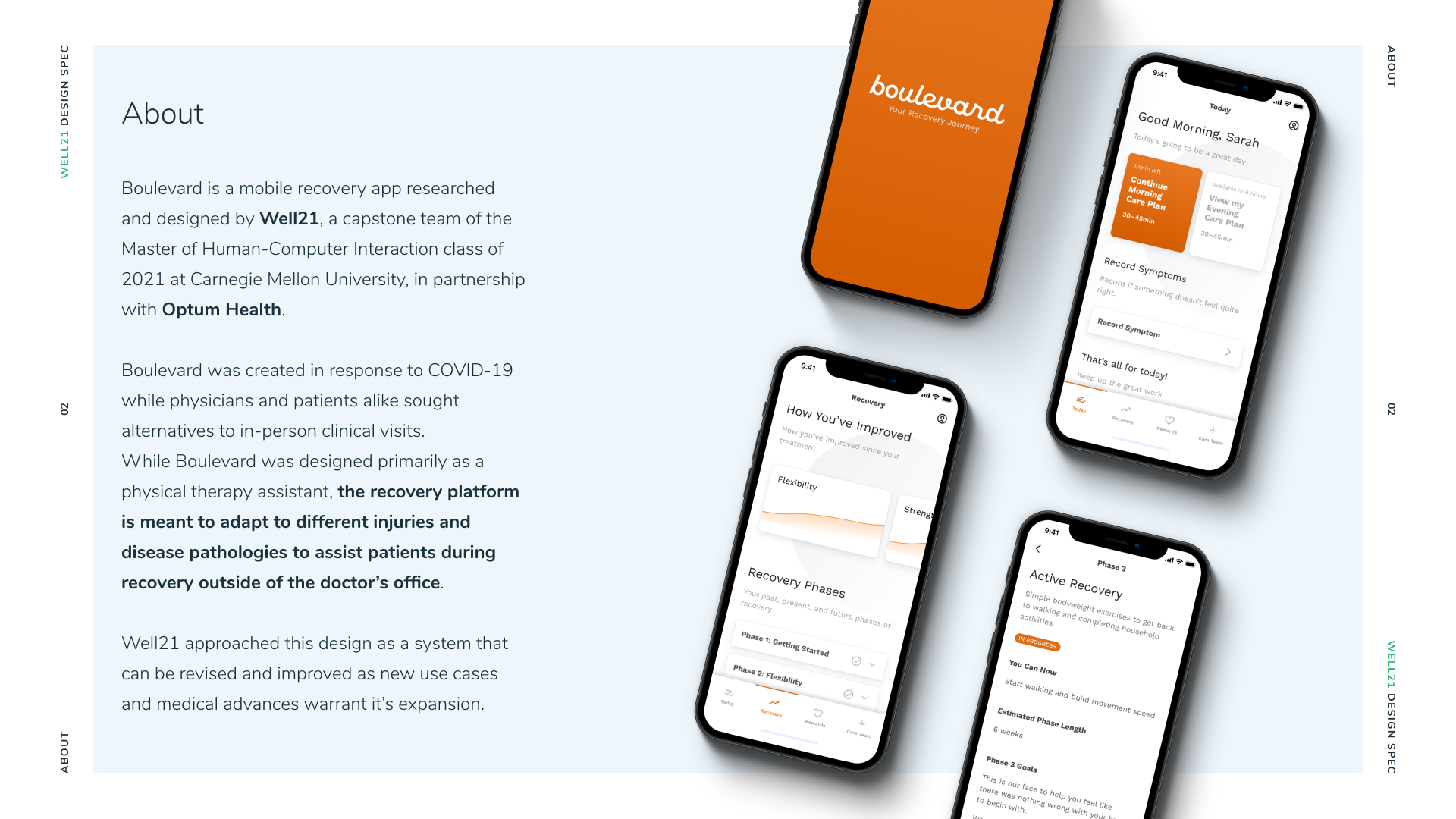
For my Master of Human-Computer Interaction capstone project, my team Well21 partnered with Optum to design Boulevard, a versatile mobile application and design system for holistic patient care. As a previous COVID-19 return-to-work symptom checking app was in the process of being deprecated, our team’s goal pivoted to create a digital product to assist with patient care regardless of disease or injury condition.
Through the project, I led the creation of the Boulevard design system, mobile product design, and brand identity for our team and product. I also mentored and art directed for my team through iterative prototypes, client presentations, and reports. Additionally, I was a contributing writer, researcher, and project manager.
My Role
Visual & Interaction Designer
Client & Context
Optum, capstone project for MHCI at CMU
Deliverable
Interactive prototype, design system, & strategy reports
Links
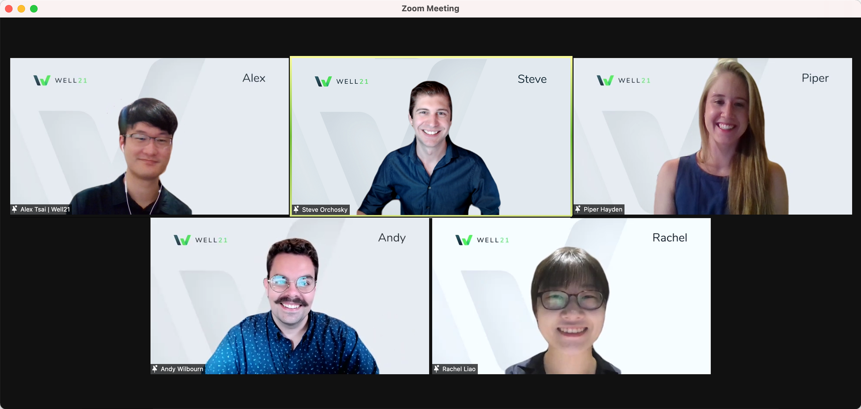
Additional Team
-
Andy Wilbourn
UX Designer
-
Alex Tsai
Narrative Designer
-
Piper Hayden
Service Designer
-
Rachel Liao
UX Researcher
Background
Designing for the “unprecedented”
In the beginning of our capstone project, our initial project brief was to conceptualize a potential future for ProtectWell, an app for employers to monitor COVID rates across employees as they return to the office. While most of our early research focused on infectious disease mitigation, we worked with our sponsors at Optum to open the scope toward a solution that could address the intersect between multiple disease and injury conditions.
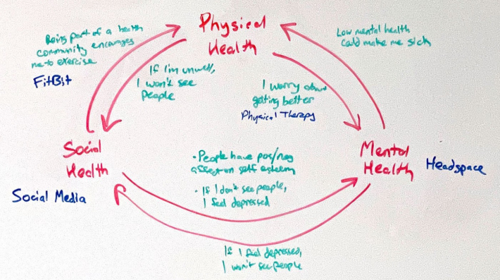
By looking at health through a broader lens, our team could draw patterns around how patients view recovery from seemingly disparate diseases and injuries. We sought to explore how a digital platform could help patients manage their at-home care plan in a way that acknowledges all aspects of them as a patient regardless of their condition.
Research
Understanding and identifying the right problem to solve
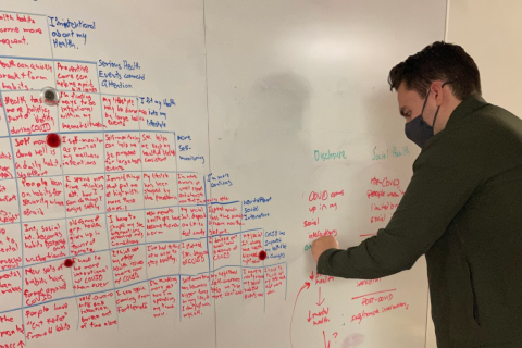
From February to May, we designed and conducted nine user-centered research studies, resulting in over 1000 survey responses and more than 70 interviews to understand health, wellness, and recovery from the patient’s point of view. This research informed six insights, which we distilled into three team values brought focus to our design concept.
Adaptable Solutions
1. When my situation changes, I become aware that I can change my behaviors to pursue health goals.
2. When I’m feeling good, or not having to think about my health, I see myself as healthy.
Information Collection
3. Managing health is stressful, so I use my past experience to guide me.
4. I need the right care at the right time, but don’t know where to look for it.
Motivated Action
5. When my health is struggling, I look for anything to help myself feel more in control.
6. Being healthy all the time is hard, and I need help to do it, since I usually fail.
For a detailed explanation of my research, and how our team reached these values and insights, I recommend reading from our team’s Medium page, specifically Drawing Lines and A New Focus on Hidden Health Needs.
A few sequential events happened from this point that shaped our design direction for the rest of the project. The first was the prevalence of vaccine distribution in the U.S., which welcomingly created a sharp drop in engagement for ProtectWell. This ultimately led to ProtectWell announcing that they were being dissolved into other product teams at Optum, and gave our team encouragement to explore beyond just COVID-19 to see where our research would apply.
Reframing
Mapping patient journeys uncovered a new, adaptable opportunity for Optum
We realized ProtectWell wasn’t designed to aid with recovery when someone contracts the disease. This piqued our curiosity, so we started to explore recovery apps on the market and found that there weren’t any solutions that aided in at-home recovery and were backed by a large healthcare organization such as UnitedHealth Group.
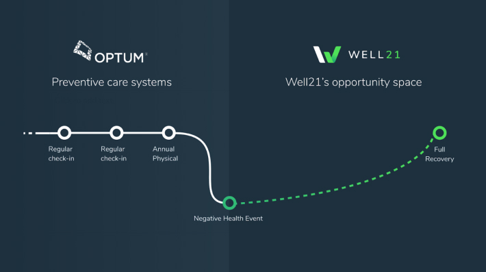
We looked to research by Richard Normann to unbundle the aspects of healing from COVID-19 and understand what themes could apply across the treatable injury and illness space. We came to the following map to generalize how people are treated.
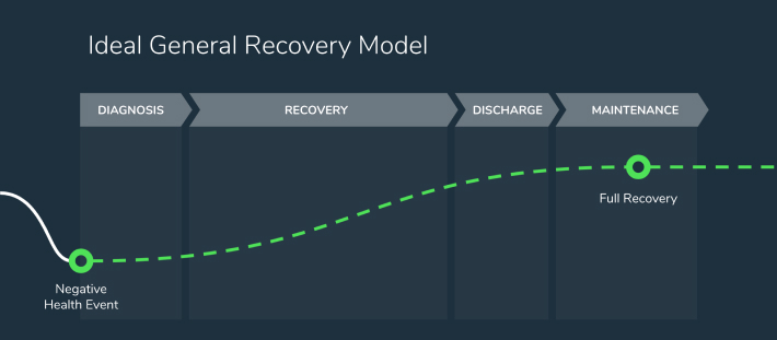
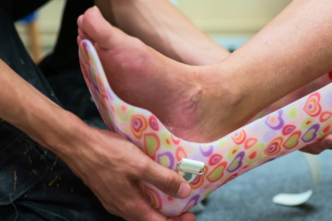
For this map to hold true, we were eager to test it by focusing on a very divergent patient pool from an infectious disease. We decided on soft tissue recovery patients because of their length of recovery time, high frequency of patients with readmissions, and value to Optum.
Prototyping
Four patient-tested themes that drove our iterative design process
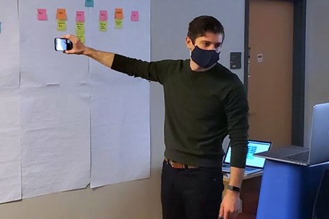
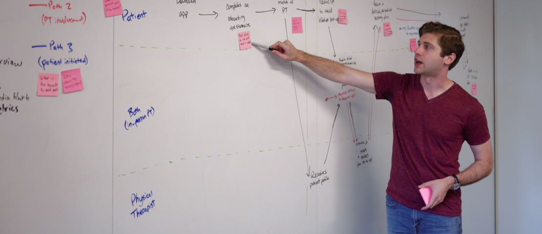
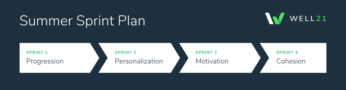
With eight weeks left in the project, our Summer semester focused on research through design, while concurrently developing a high-fidelity design to hand off to our clients. We conducted four sprints based on different themes that we co-created with our client sponsors.
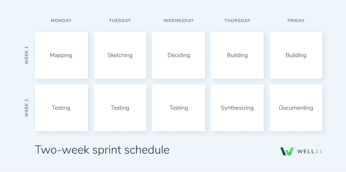
To address these themes, we adapted Google Ventures’ Sprint Model into a two week format. The first week would map a customer journey, rapidly generate ideas, isolate the highest risk-reward design opportunity, and build a prototype to test while recruiting participants. The second week was three days of testing with real patients, followed by synthesis and documentation of what to move into the high-fidelity prototype.
For more on our sprint schedule and rapid prototyping approach, I recommend reading Back on Track and Full Steam Ahead on Medium.
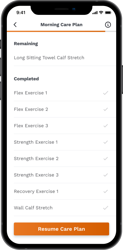
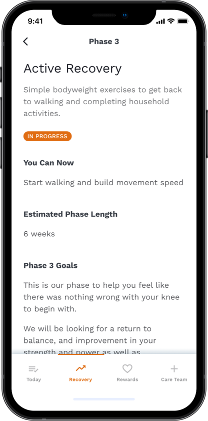
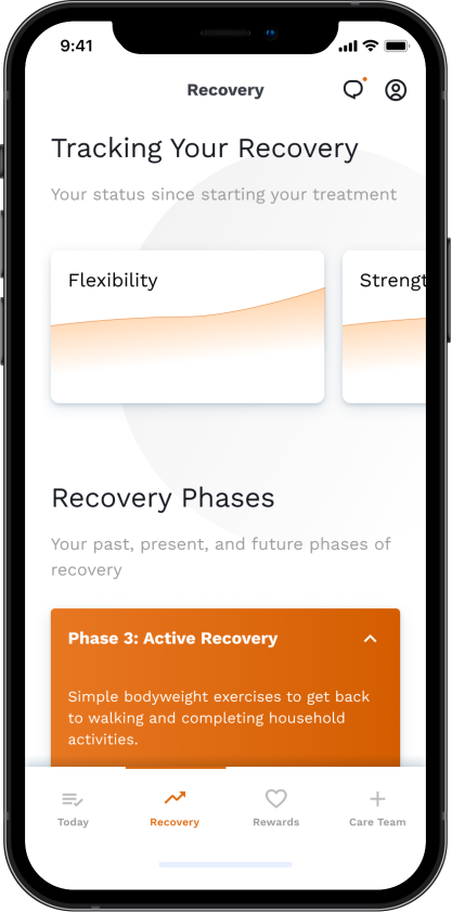
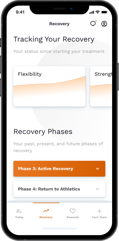
How might we communicate a patient’s stage in the recovery process?
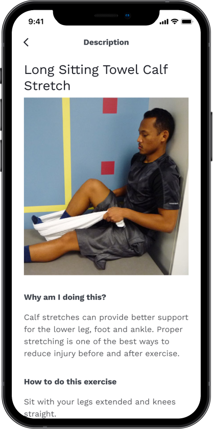
I created a screens illustrating a daily exercise list, walkthrough of an exercise session, patient progress over time, and recovery phases.
Findings
- All six out of six participants could successfully estimate how much longer their physical therapy would take
- All participants would use a recovery app at least 4–5 times per week, primarily on days they do not have in-person physical therapy sessions
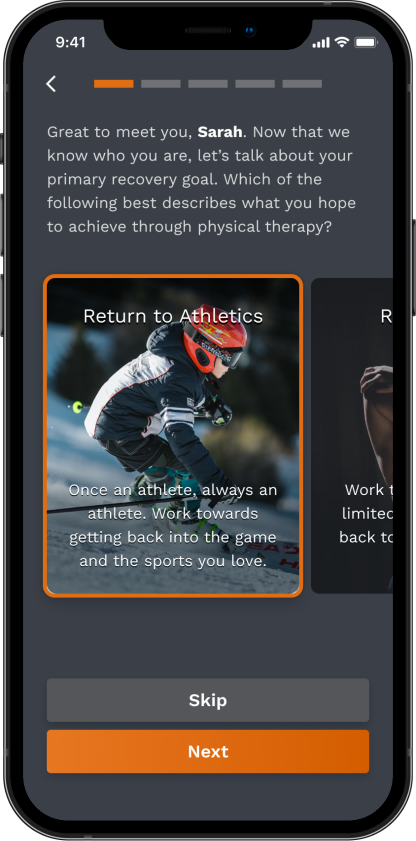
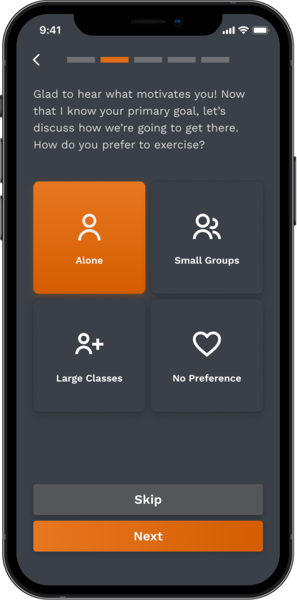
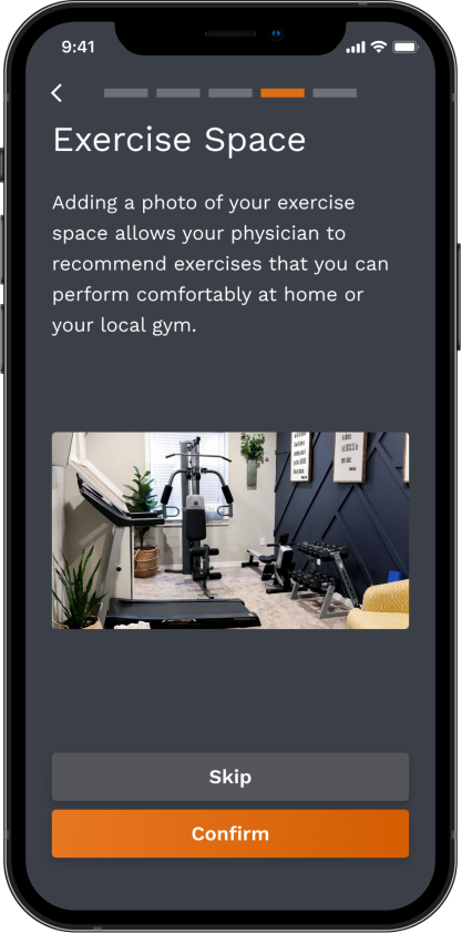
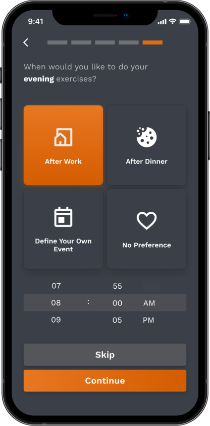
How might we use data collected from onboarding to create a defined, universal recovery journey across a patient’s care team?
I created mobile app screens illustrating a new user onboarding experience, where participants shared recovery goals, exercise preferences, calendar data, photos of their recovery space, and reminder preferences.
Findings
- At least seven of eight participants were comfortable setting their recovery goal, photos, and push notifications
- Sharing calendar data with our app was the most apprehensive part of onboarding; two participants skipped and two expressed verbal hesitation before agreeing
- Onboarding is perceived as quicker than in actuality
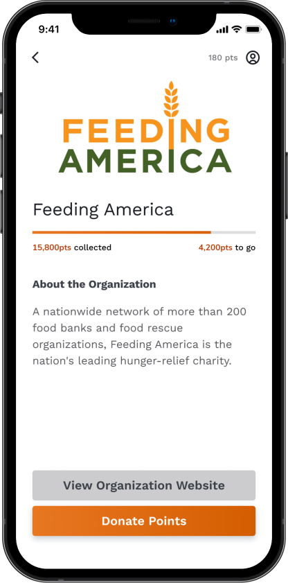
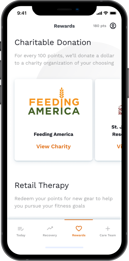
How might we establish a trigger and reward system that gets people to build new health behaviors?
Mobile app screens illustrating a mindfulness activity, where after completion, participants earn money to donate to a charity of their choice.
Findings
- Brand recognition, cause alignment, and personal history were leading influencers for which charity a participant chose to donate to
- When asked about the rewarding nature of this interaction on a scale of 1 (least rewarding) to 5 (most rewarding), participant responses averaged 4.71, suggesting people highly value helping others, even when they are recovering themselves
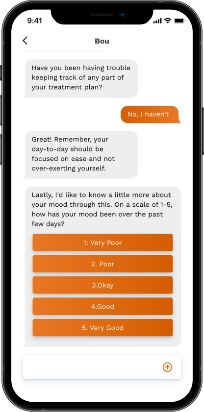
How might we adjust a soft-tissue recovery model to meet the needs of infectious disease patients?
I designed app screens illustrating a care routine for a patient with COVID-19, which my team paired with an automated chatbot to test an alternative recovery interaction.
Findings
- Six out of six participants acknowledged they would use a symptom tracking app daily during their recovery
- Participants generally favored interacting with a mobile app more frequently than with a chatbot
Design
Making a versatile system that is ready to implement and open for expansion
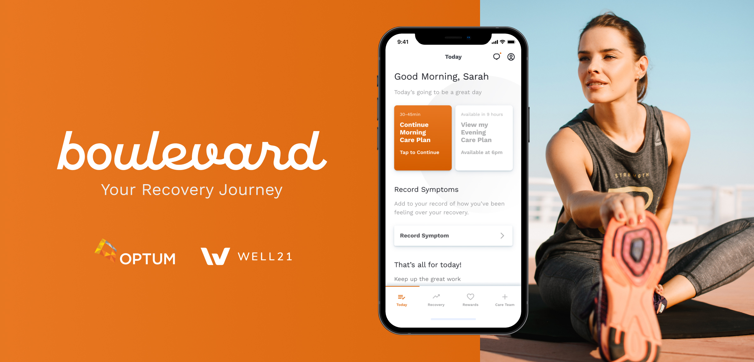
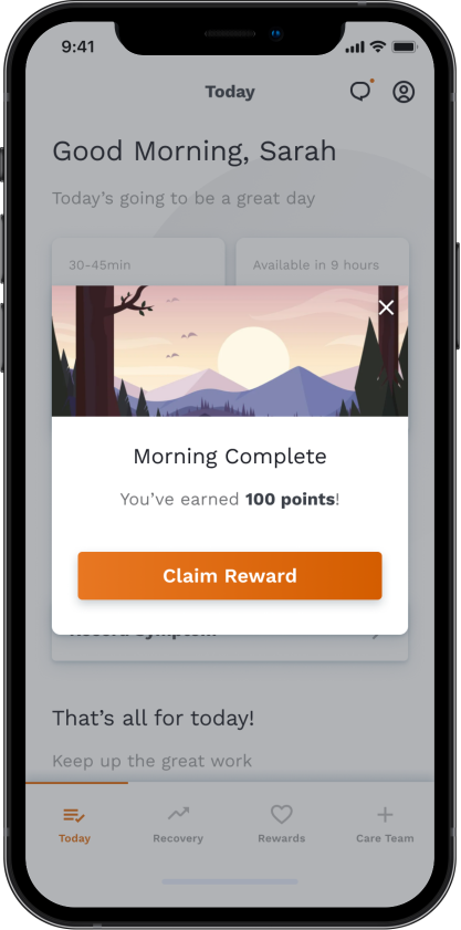
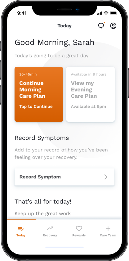
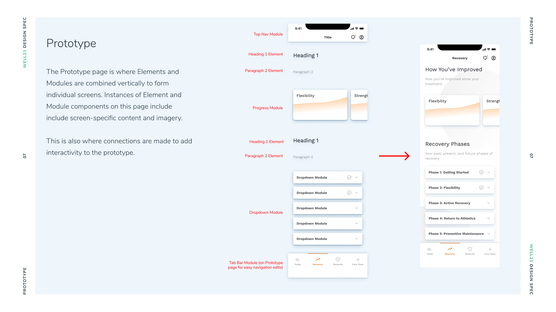
With the findings from our individual sprints, I created two high-fidelity interactive mobile prototypes for our client to use. The first and more in-depth focused on an ACL tear patient, Sarah, who is halfway through her recovery journey. The second is the same UI applied for a COVID patient to track and monitor their symptoms.

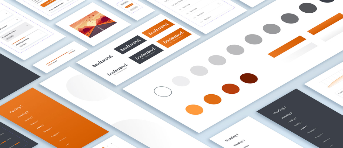
Because flexibility was an important part of our design solution, I also created a design system of reusable components for Optum to build from, as well as documentation for how to maintain and continue growing the system to address future conditions.
Reflection
A few of my biggest learnings in product design leadership
This project has given me a wealth of experience, but here are a few of the most important ideas that I’ll take with me into every team project moving forward.
Work smarter, not harder
While we were excited (and at times felt pressure) to create high-fidelity design work early on, I suggested in the beginning that we use our budget to purchase a design component system for rapid prototyping. This saved on design time immensely, and gave us room to be more ambitious with our prototypes since we knew we could pivot quickly if something wasn’t working.
Nothing can be over-documented
In the MHCI cohort of 2021, we were the only team out of twelve that was international. With two team members offset by twelve hours from the three of us in Pittsburgh, we used thorough notetaking and a detailed backlog of assignments in Notion so people could work their own hours. We also held regular 8am EST standup meetings over Zoom which we prioritized tasks that needed full team alignment. By creating a handoff system every morning and evening, we turned this obstacle into an advantage where our team was constantly creating.
Team goals versus individual goals
Even though after eight months everyone shares an MHCI degree, I can’t express how diverse the backgrounds and interests were within our team. During our Spring Semester, I suggested a rotating system of 1-on-1 calls, where every week four teammates get into pairs (with one team member taking the week off) to meet for a half hour and discuss their personal interests and goals within the program. We used this time for goal setting, specific questions based on expertise, a channel for conflict resolution, and keeping everyone involved even when across the globe.