Smart Entry Mobile App
Mobile app companion for an iOT smart door
Background
Enabling remote access for Smart Entry users
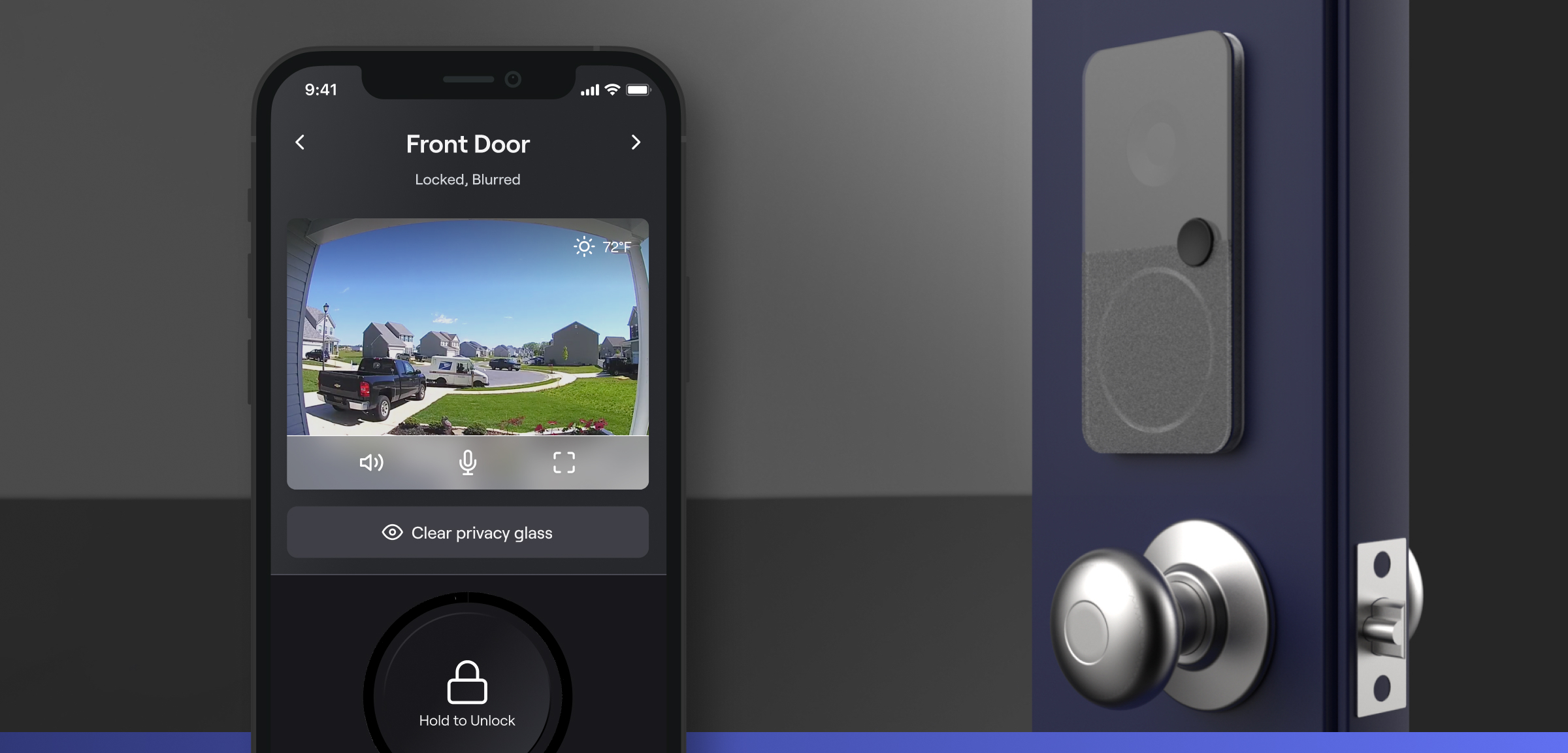
With my team at frog, I partnered with a client in the home goods space to create a proprietary “Smart Entry” system for Home Owners. I led the design of a functional mid-fidelity mobile app controller, which I was later responsible for evolving into a high-fidelity mobile prototype. I also contributed to establishing and documenting interaction design patterns with the physical door, led 3 user research initiatives, and facilitated multiple remote workshops to gather product requirements and establish a feature roadmap.
My Role
Mobile Design Lead
Client & Context
Fortune 500 home goods company, client of frog design
Deliverable
High-fidelity mobile app prototype, iOT smart entryway prototype, information architecture, and user interaction diagrams
Additional Team
-
Mitch Murphy
Design Director
-
Jason Jian
Visual Designer
-
Ryan Starling
Design Director
-
Whit Jardine
Product Manager
-
Joe Gonzalez
Industrial Designer
-
Videl Smith
Design Technologist
-
Jasmine Busch
Director of Program Management
-
David Hezlap
Assoc. Director, Solutions Architecture
-
Kaz Saegusa
Assoc. Director, Design Technology
-
Fran Wang
Assoc. Director, Mechanical Engineering
-
Shining Li
Sr. Strategist
Background
Bundling modular iOT features into a single product offering
Our client reached out to frog with the goal of creating the first all-inclusive “Smart Entry” system. This brief was established because of market pressure from a competitor, Masonite, who recently release a Smart Door in partnership with Ring and Yale. Our client sought to create their own Smart Entry system that didn’t feel modular and could be offered as an all-in-one proprietary product.

User Stories
Aligning the necessary features for MVP with the project timeline
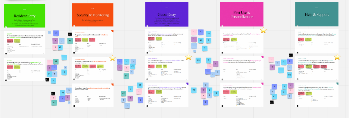
I first needed to establish a set of user stories to guide my interaction flows. I collaborated with the design and product team at frog to run a series of discovery activities with our client and documented some high-priority user requirements.
Door Mode Diagramming
Illustrating user stories with limitless synchronous product feedback
After establishing user stories, I first believed that translating the user stories into storyboards would the best way to visualize requirements. Given the amount of variability in sensor inputs and feedback the door needed to produce, I realized that storyboarding was not an appropriate way of communicating both the story of usage and the product interactions simultaneously.
I changed tactics to instead create two complementary documents. The first was a journey map showing how users flow between different proximity zones around the door over time.
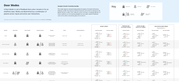
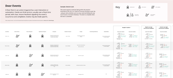
The second was a lexicon of Door Modes and Door Events, highlighting the expected inputs and feedback from the Smart Entry during use. By bundling the 11 component signals into modes and states, I could communicate easily with the prototyping team what feedback should be expected from each component of the door at a given time.

Mid-Fidelity Design
Prototyping the main remote control interactions for the door
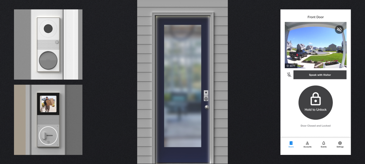
The primary interaction design deliverable was to create a remote control for accessing the door. Instinctively, I created a layout that closely emulated the control panel on the door.
Information Architecture
Mapping out the holistic experience
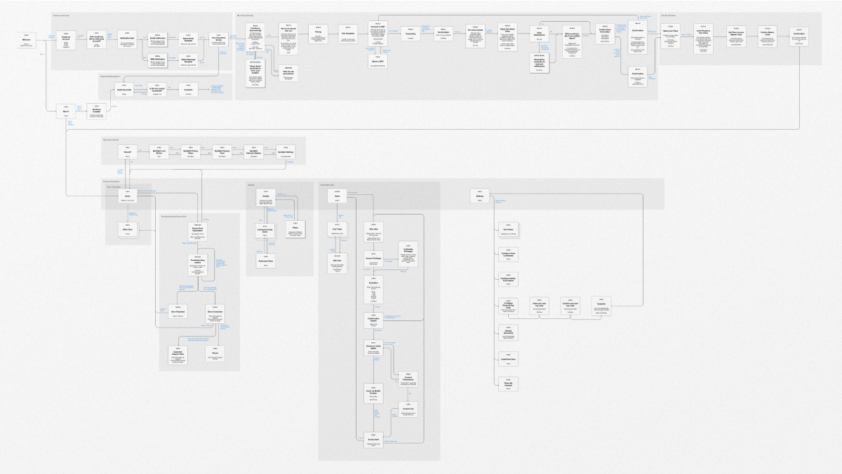
To understand the necessary functions outside of the main interactions, I created an Information Architecture to outline future flows for user set-up, adding and editing users, activity logging, and notification settings. I also used this document with our product team to highlight which user flows would be MVP and which would be added to a backlog for handoff or future work.
Validation Research
Testing usability across a broad range of home owners
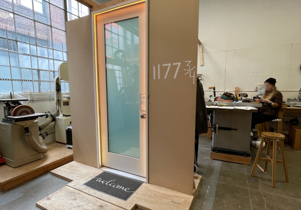
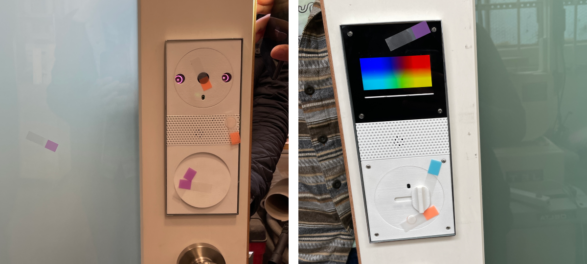
Throughout the entirety of the project, I facilitated 3 research sessions, with 5-7 participants each. Two sessions were in-person and used the Smart Entry and mobile app prototype simultaneously. One session was conducted virtually to test the mobile app prototype in isolation. Each session was formatted with a semi-structured interview introduction, a usability test with 2-4 workflows, and a closing reflection interview.
Synthesis
Identifying user needs and correcting false assumptions
For the semi-structured interview questions, we synthesized the information using an affinity map to cluster similar feedback to be translated into actionable insights.
For usability testing, we positioned notes on top of their respective user flows. This gave us a ‘heat map’ of problem areas that should be addressed before moving to higher-fidelity prototyping.
User Permissions
Redesigning the add new user flow to work for all residents
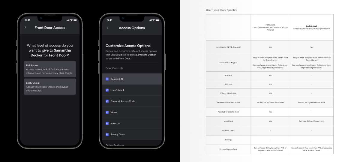
Through user testing, I gathered a lot of feedback around different types of users both inside and outside of the household. Specifically, users wanted to give kids and extended family curated access to only a few select features. These insights led me to change our existing labels from user-type driven language (Owner, Resident, Guest) to feature-driven presets that can be customized (Full Access, Lock/Unlock).
Activity and Notifications
Prioritizing what and how a homeowner needs information about their door
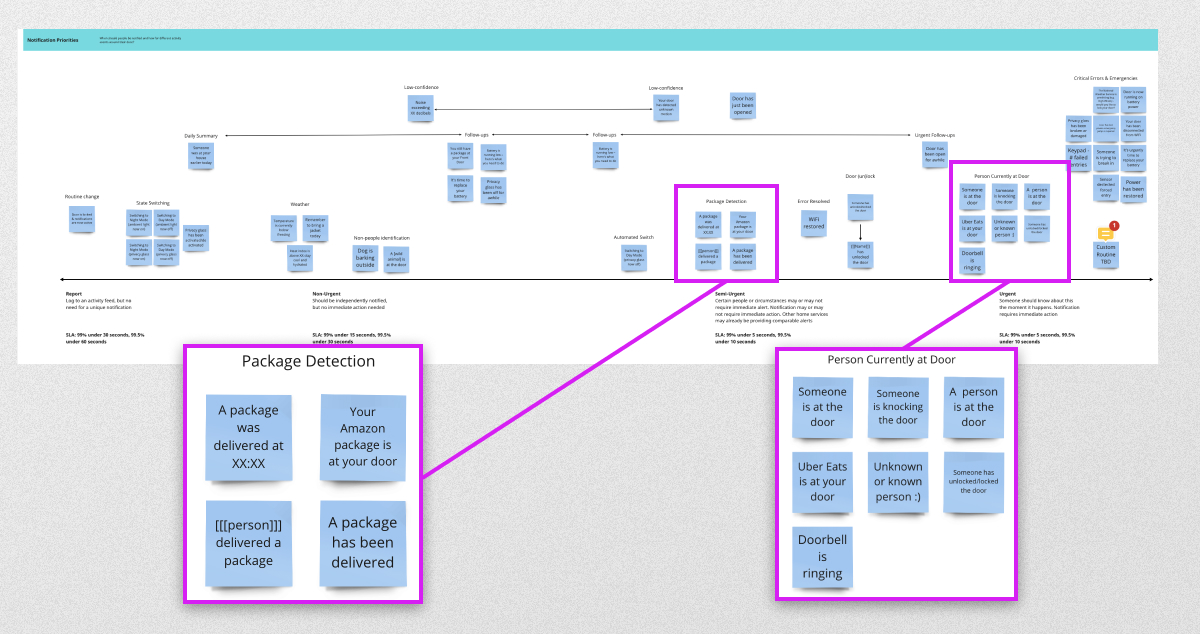
Given the number of input sensors on the Smart Entry, I thought a lot about how to avoid ‘notification fatigue’ from in-app notifications. I facilitated a workshop with members of frog and the client team to categorize all the different inputs and forms of feedback.

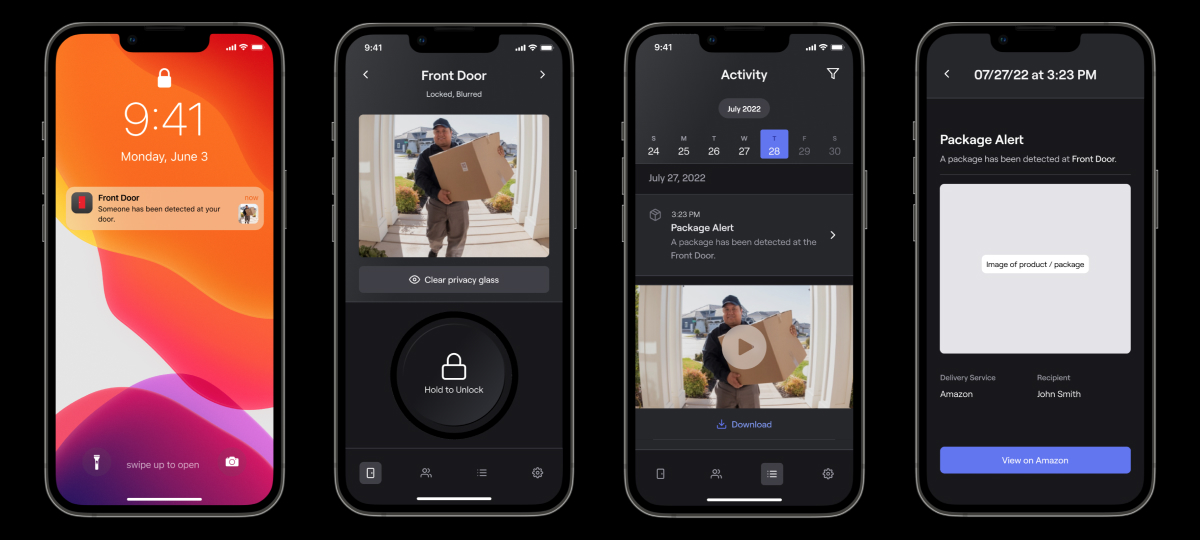
From this workshop, we created a document organizing how each could (or should) be delivered to a user. This informed how different notification types should be delivered (such as push notification, text, email summary), as well as an in-app activity feed.
High-Fidelity Prototyping
Polishing the user experience to complement industrial design
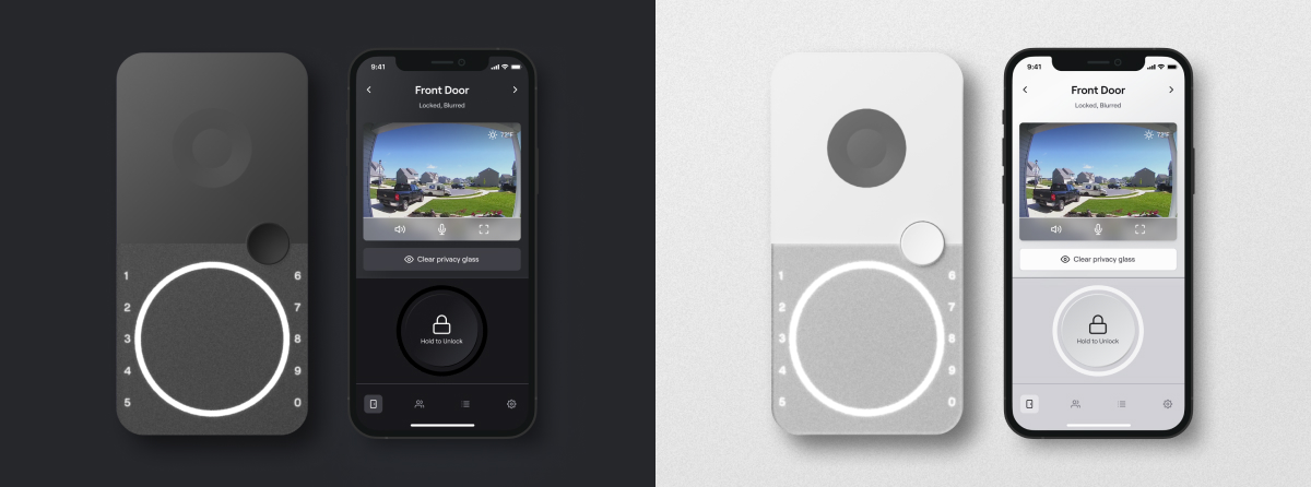
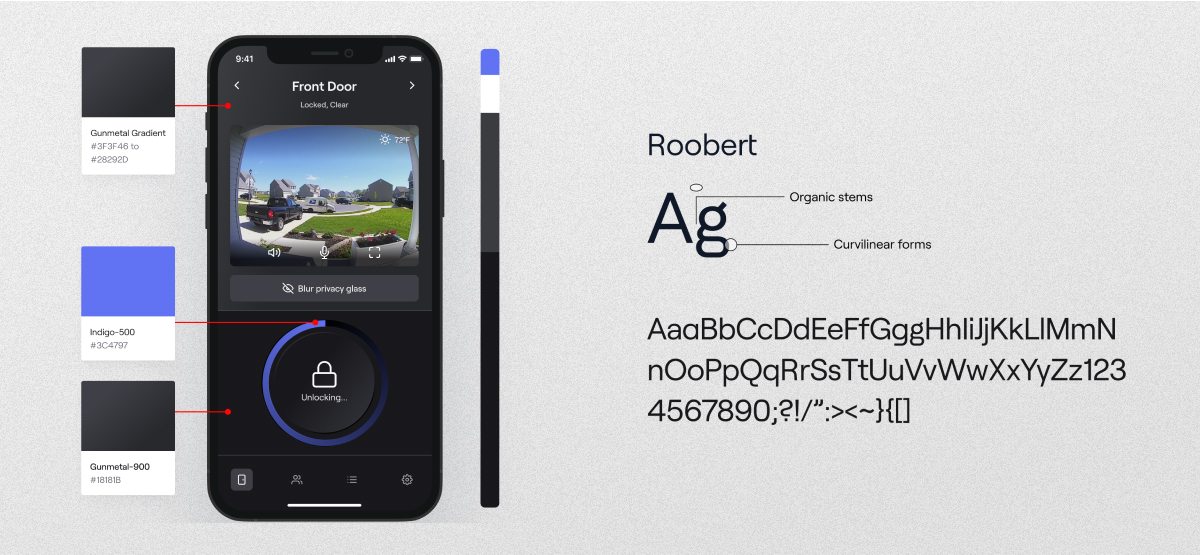
As I was working to improve key interaction patterns that we identified in user testing, I was also collaborating with a visual designer on the look and feel of the app. With the client’s openness to our recommendation on branding, we created a visual look that emulated the physical control panel on the Smart Entry, but introduced interactions that were purely digital to enhance the user experience.
Reflection
Handing off deliverables and recommended next steps
At the conclusion of this project, our team handed off high-fidelity interaction flows to demonstrate seven workflows that we considered high-frequency use cases. If I were to continue this project, I would want to continue designing from our backlog of additional user epics (i.e. offboarding/moving, interacting with multiple doors, and multi-space management) that would have been exciting to pursue.
Additionally, I would plan to work closely with design technology to create a high-fidelity component library. This way we could implement the new look into the functional mobile prototype so we could test a more realistic experience with the Smart Entry prototype.
At the end of this project, we delivered a concept that the client team was very excited to implement. Overall, I’m very proud of this work and I learned a lot around designing for iOT products, conducting usability testing remote and in-person, and collaborating with product, visual design, and technology.