U.S. Playing Card Company
Wordpress website design & development
About the Project
Stacking the deck for the leaders of the game
In this project, I established a new brand look and tone for the U.S. Playing Card Company, a client of Icon Marketing. Upon agreeing on a new direction, I designed and developed a new company website for use with brand enthusiasts and wholesale clients such as casinos. Shortly after this website went live, the U.S. Playing Card Company was acquired by Cartamundi, an international board and card game manufacturer based in Belgium.
My Role
Consulting, visual design, front-end development
Client
U.S. Playing Card Company
Deliverable
WordPress website
Additional Team
-
Jeff Nabors
Creative Director
-
Keane Anderson
Digital Designer
-
Joe McLaughlin
Client Services
Visual Identity
Create a website that tells the story and history of The U.S. Playing Card Company
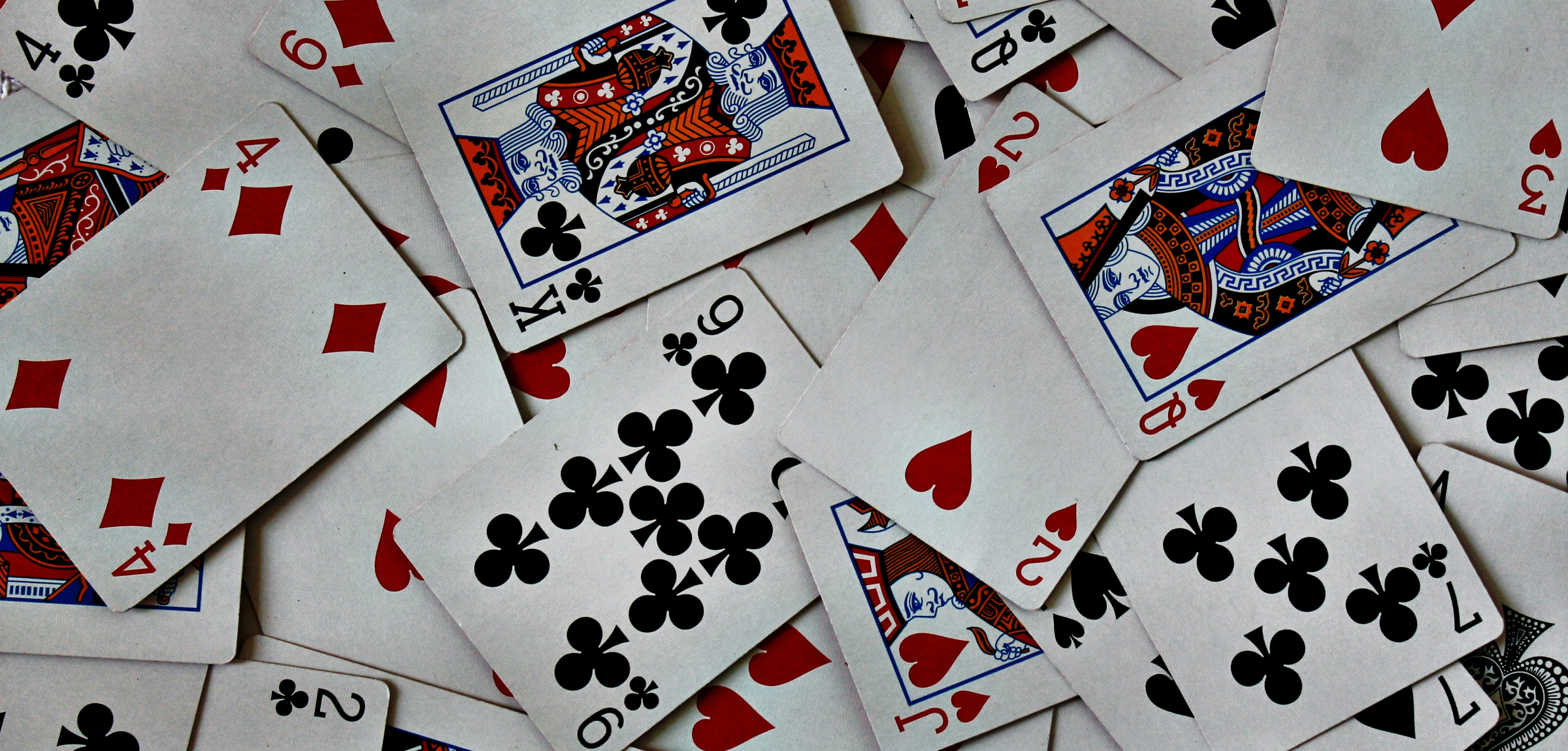
The United States Playing Card Company was created in 1876 in Cincinnati, Ohio. Much of the company’s effort has been directed toward their flagship brand, Bicycle Cards. Today, USPC has over 150 years of history and over 10 different card brands under its name.
However, it was clear that there were no brand assets or visual direction for USPC other than the logo and occasional use of Gotham as a brand font. The first goal of this project was to solidify a visual identity.
We approached the moodboard design with the three client goals in mind:
- Reflect the 150 year history of the brands
- Complement to Bicycle Cards website, not a replacement
- Appeal to casinos and wholesale customers
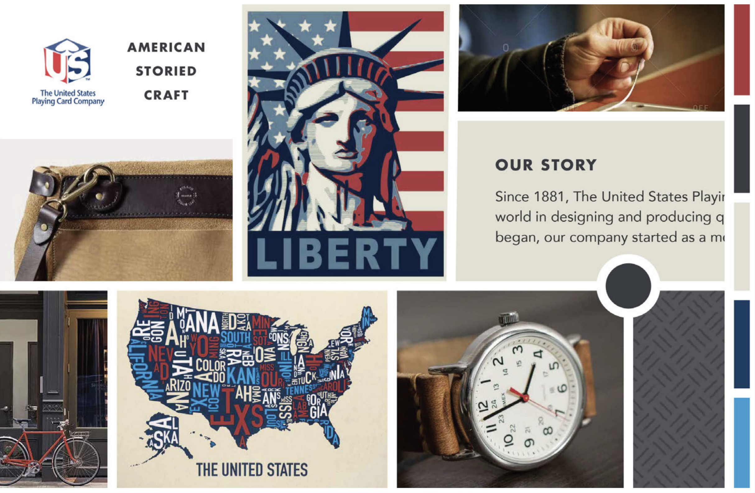
When designing mood boards, we had arrived at three distinct directions which we named Handcrafted Americana, Casino Royale, and Night Life. I was confident after our kickoff that our client would fall in love with the casino direction because it would hit home with the casino clients that would be visiting the website.
To my surprise, USPC adamently decided to move forward with the Handcrafted Americana direction. This emphasized USPC’s pride in the brand’s history for this project, which was critically important for establishing tone and voice in the subsequent deliverables.
Information Architecture
Structuring content and begin prototyping
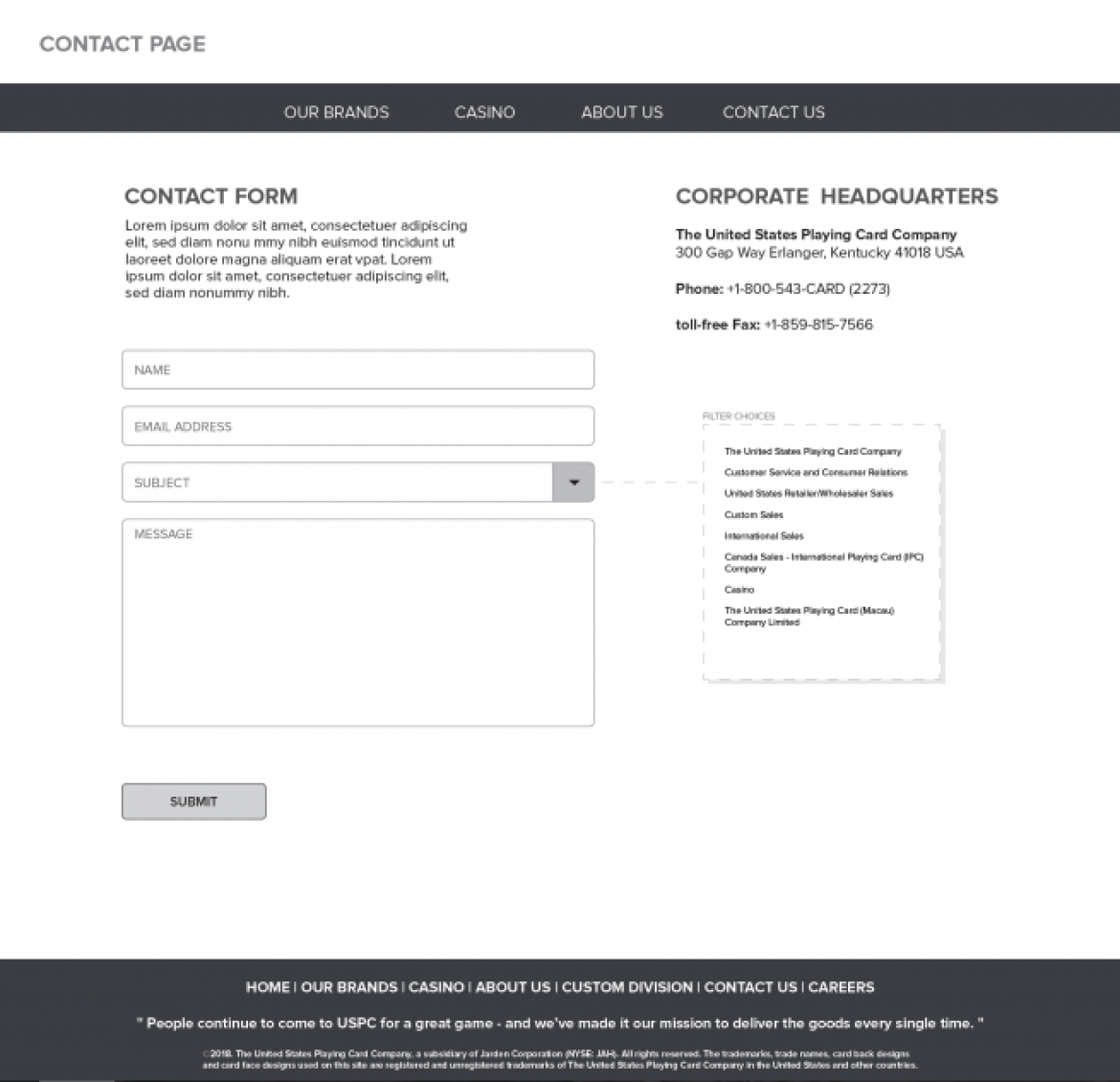
Once the USPC team confirmed the use of the Handcrafted Americana moodboard, we began organizing their content into webpages. In our sitemap, we worked with USPC to understand an appropriate hierarchy of information. We agreed that the homepage should focus on brands, with easy access to historical and casino-based content.
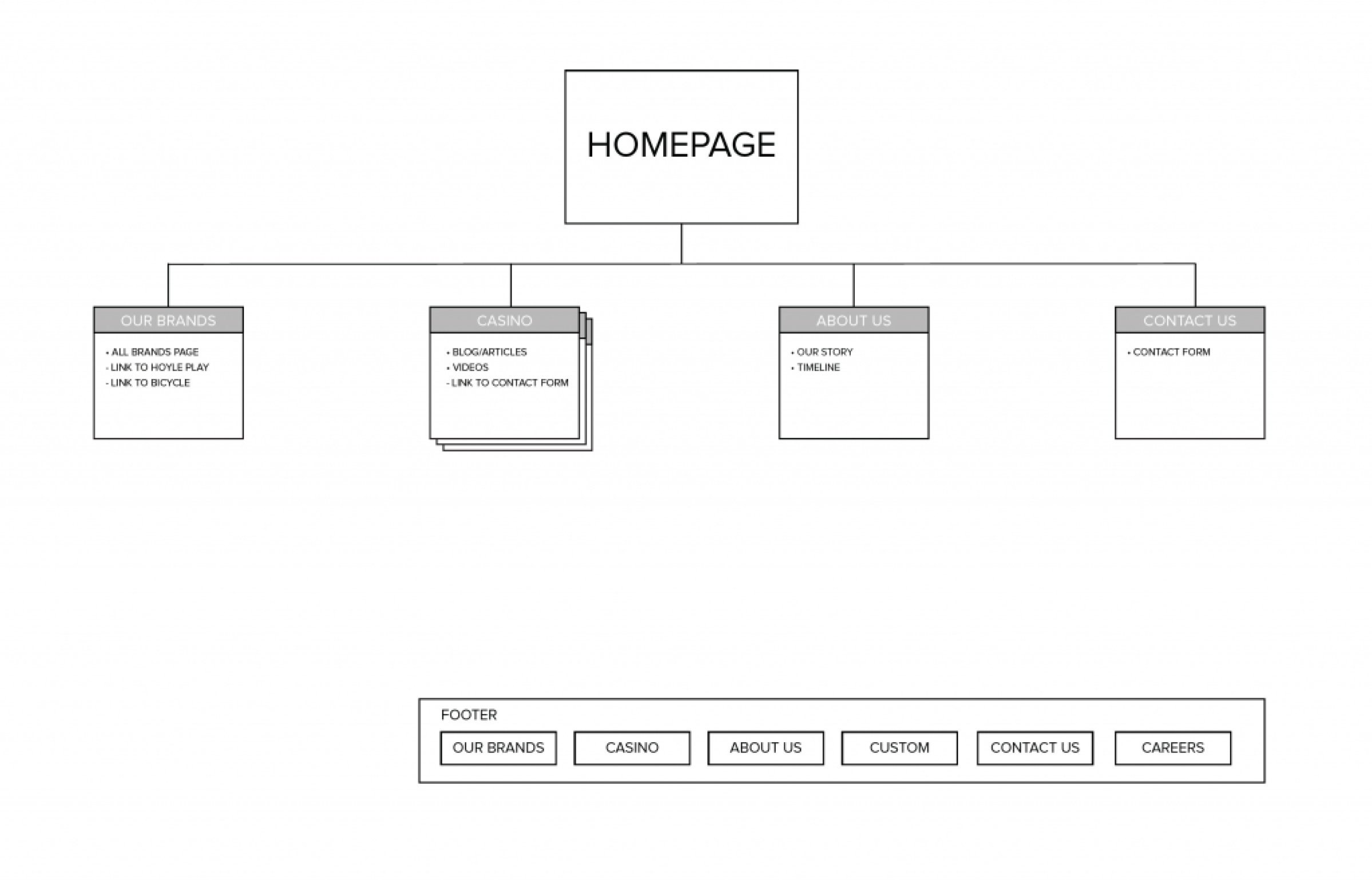
We used our sitemap to plan for and pitch a few interactive features:
- A casino blog for upcoming trade shows and product releases
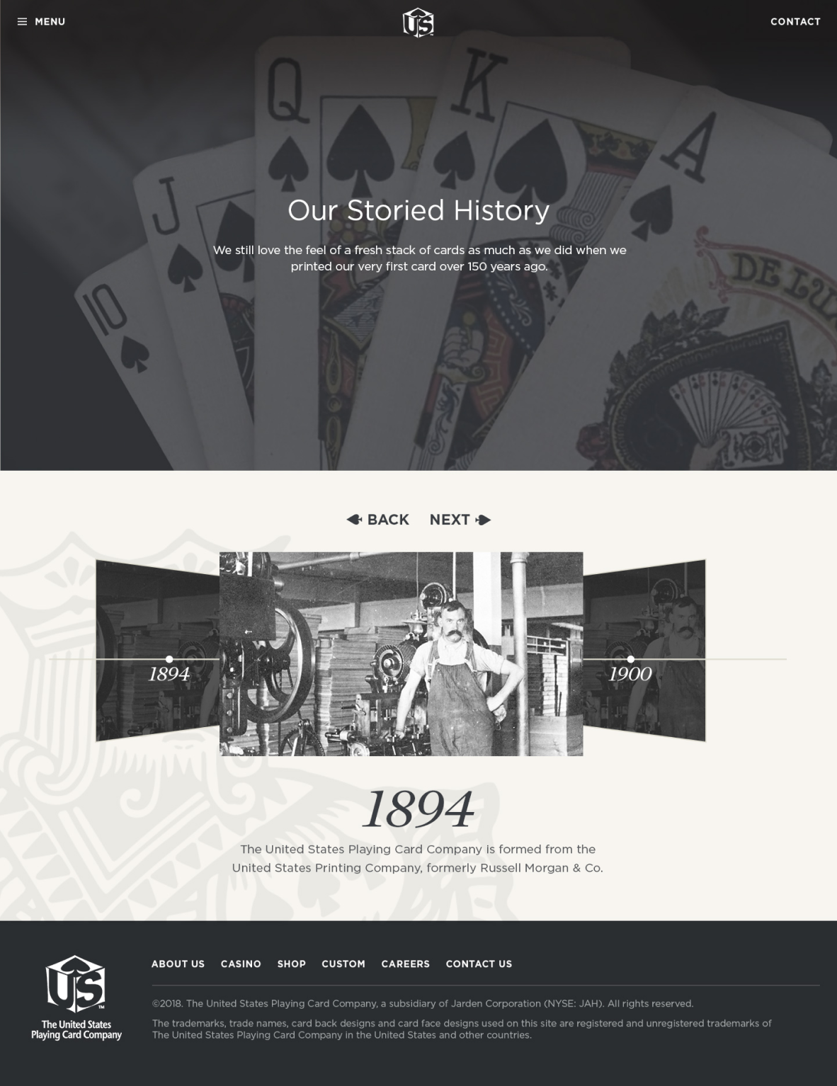
- An interactive timeline for the About Us page
- An email contact form that sends to a general inquiry account
In addition to creating the sitemap, we created wireframes to share with USPC to communicate our content structuring plans for each individual page.
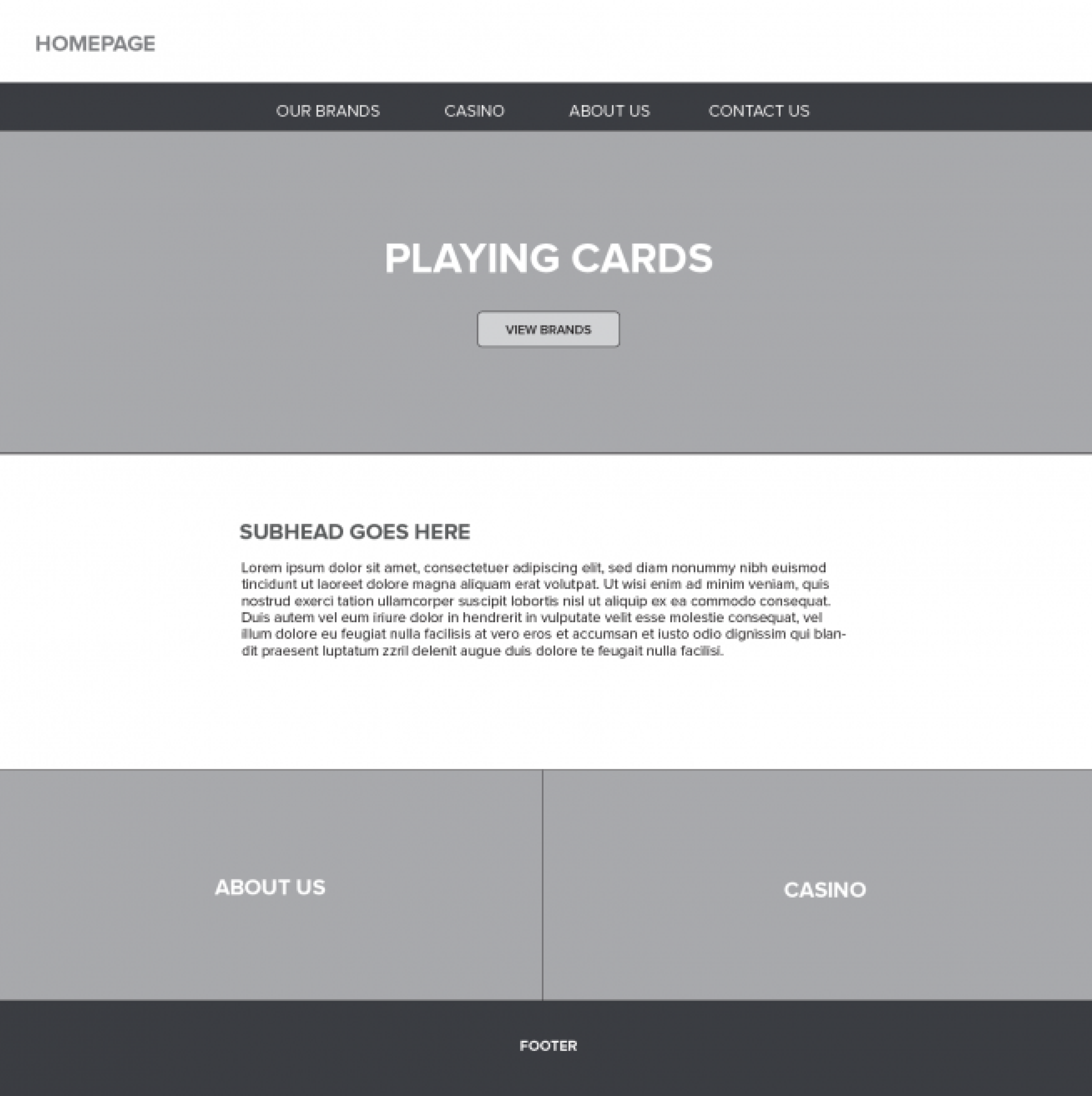
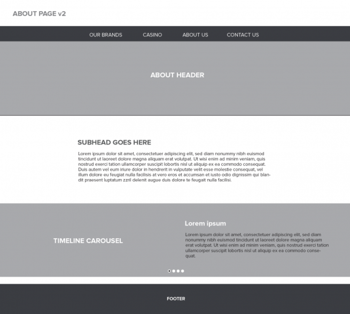
Upon reviewing the sitemap and wireframes with USPC, we decided to remove brands as a standalone page due to inconsistent depth in the history of each brand. Instead, we decided to reference the most notable brands on the About Us page in the history carousel.
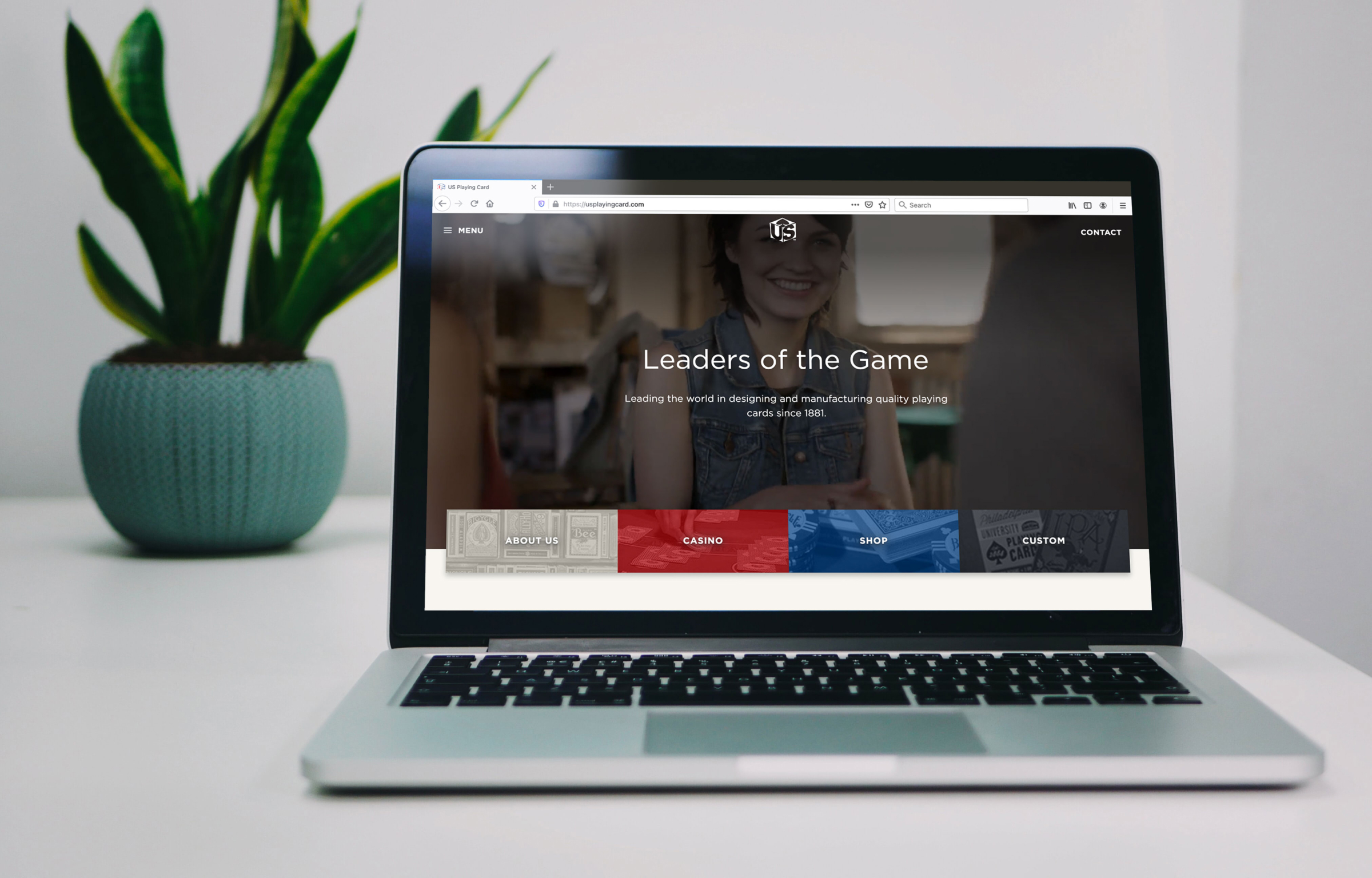
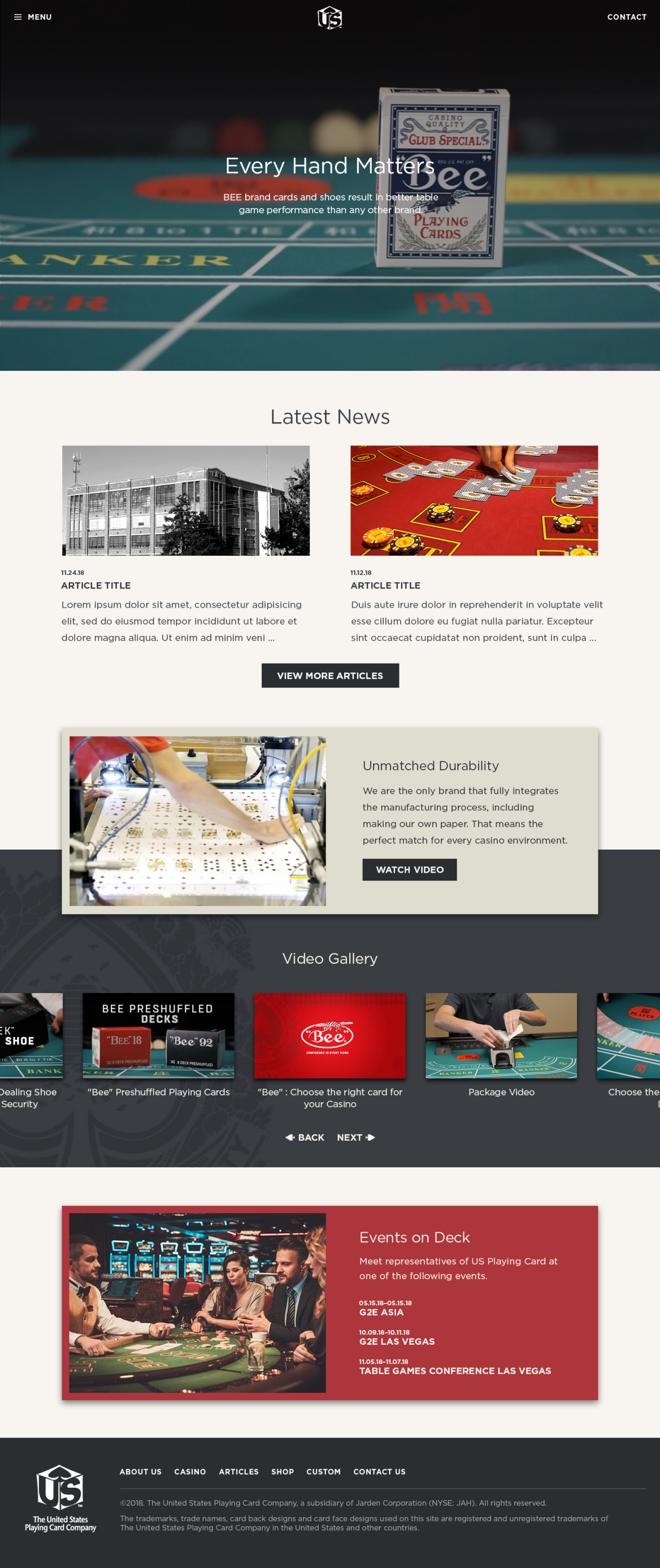
From here, we designed a high fidelity prototype using Photoshop and Invision. With inspiration from our moodboard, the transition from low-fi to hi-fi was fairly seamless, which allowed me to quickly start developing. I built this site using Wordpress because it is also used on Bicyclecards.com, and the digital content team at USPC was already very comfortable editing content.
Final Website
I sourced videos from Shutterstock that had a similar color scheme as our moodboard. I edited four different clips of varying angles in Adobe Premiere to create as smooth of a loop as possible.
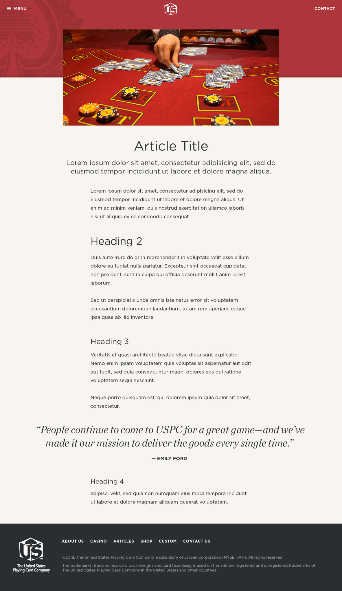
Additional Pages
Reflection
Handcrafted Americana was the right brand direction for USPC.
This project was a great experience for me to work with a well known brand and show off my creativity and expertise as designer and developer.
Moodboards as a Client Touchpoint
In previous projects I’ve worked on, a moodboard was typically and internal tool used to get buy-in with creative directors. The USPC client team expressed interest in being involved in the creative process, and our moodboard became an important reference point for our team and the clients for each decision.
Understanding Wordpress Gutenberg
This project was my first chance to develop a website using Wordpress’s new (at the time) Gutenberg content framework for theme development. I was very impressed by the flexibility it offers clients, however with this came lots of new considerations for what components on a website should or shouldn’t be client editable.